Apple TV Update Sneaks in a New Photo Wall Screen Saver

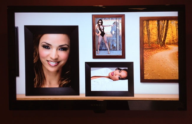
I use Apple TV's and HDTV's throughout my studio to display my photography. When I did my last update to Apple TV for some reason it forced a factory reset and while it was no big deal to set it up again, I discovered that there were a couple new choices in the Slideshow/Screensaver area. One of them is called Photo Wall.  I love this one because not only does it frame your images in a variety of nice frames that float by, it adds nice touches like mattes and a 3D spin when it hits the corner of the virtual room. It's like you're walking along a wall of photos and you get to the corner and turn to walk down the next wall. Nicely done!

You can get an Apple TV 2nd Gen here for $99.

Metal Mural Rocks!

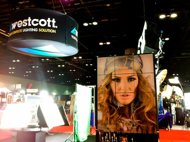
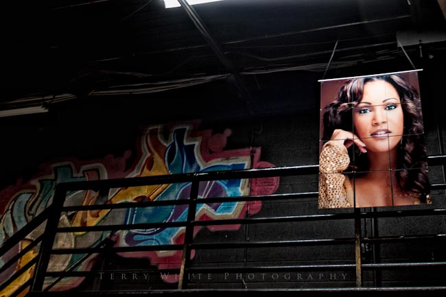
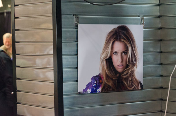
Having your photographs printed on metal is not a new thing. I've seen companies like MPIX and others offer this for a while now. However, like many other printable products, you really take notice once you see one of your own images on it. I remember walking onto the Photoshop World show floor last year and seeing one my images on display in the Westcott Booth. While this is not a new thing for me, it was a new thing seeing my print on metal! The print was done as a tiled 3'x4' metal print. All I could say was WOW! I never made the time to go by the Metal Mural booth and check them out. 

This year I took the time…

At this year's Photoshop World Vegas I spent a little more time on the show floor and I went by the Metal Mural booth. I saw my same print, but on single tile on the table used as a sample. This time I got to touch it and admire the quality. Next thing you know I was placing an order. The show special didn't hurt either 🙂 The way it worked was I place the order and paid for it on the spot. Then once I got back home I used the invoice number to upload the photo that I wanted to have done. They let you download a Photoshop template to use to make sure that the cut lines don't go across anything critical. A few days later I received an electronic proof. It looked good and I gave them the thumbs up to print it.


When it arrived, it was complete with all the hardware necessary to hang it on the wall or suspend it as I did (hanging wire not included, some assembly required). I took one of the tiles out of the box and the first thing I noted was that the color was dead on! The photo above doesn't do it justice. It was probably the most color correct print I've ever received. I did nothing special on my end. They apparently just know what they're doing!

The tiles are UV coated and scratch resistant. 

You can find out more about their products, pricing and configurations here.

On Location: My Abandoned Warehouse Fitness Shoot

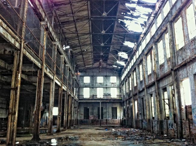
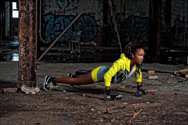
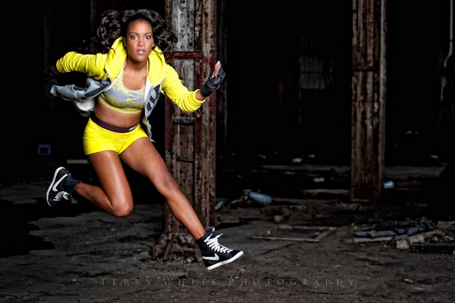
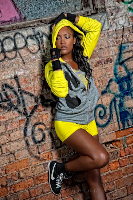
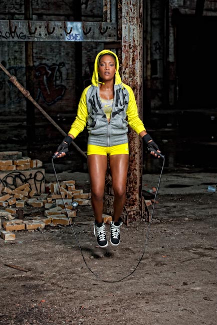
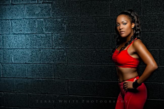
I wanted to do a fitness shoot. However, I didn’t want it to be just another shoot in my studio. I started looking at fitness shots like the ones in the Nike ads and I saw a consistent theme. The shots were mostly done outside and against interesting backdrops and walls. This lead me on a search for a location. It didn’t take me long to find a spot. I have to give credit to my photographer buddy David Birdsong for turning me on to this abandoned warehouse in downtown Detroit. I saw a shot of it in his portfolio and had to find out where it was. He gave me all the details.

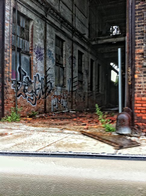
There are lots of abandon buildings in the Detroit area. However, as you would expect many are boarded up or have no trespassing signs. This gem is wide open. There is a big 10′ open door right at the street with great parking.

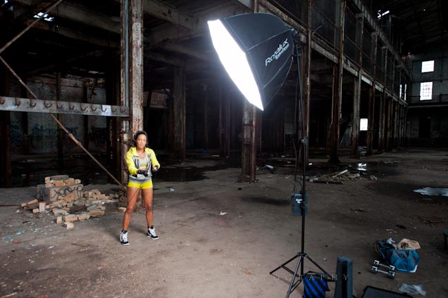
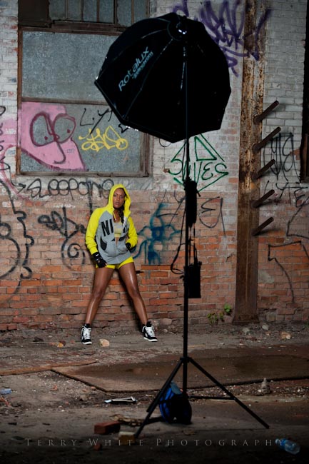
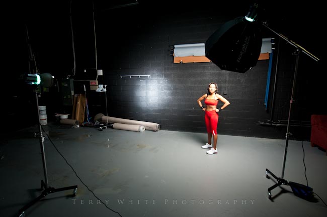
I brought my Elinchrom Quadra for lighting as well as a deep octa softbox.

When you shoot in an abandoned building all bets are off when it comes to safety. Everything is “at your own risk”. Remember, technically you’re not supposed to be there.

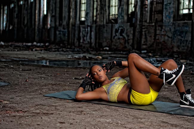
You have to also be careful not only with your equipment, but also with the debris and broken glass. Falling is definitely not recommended 🙂 We ended up just discarding the mat we brought because it was just too dirty to bring back.

I couldn’t get enough of this place, but I was on a time limit. I had a flight to catch later that evening as well as some more shooting to do in studio.

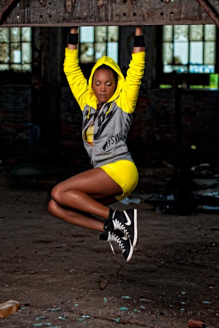
My beautiful & amazing model Kandice was a total trooper during the shoot. It was pouring down raining, wind blowing, dusty, dirty, etc. the whole time and nothing phased her.

One thing I’ll definitely bring next time is a broom. Also having some rags to wipe down everything after the shoot is over would have been really great.

In the shot above I managed to get more of the surrounding area. In many of the shots I took I wished I had done this more. I was too tightly composed on Kandice.

The Elinchrom gear performed like a champ. No issues with battery life or remote triggering with the Skyport Triggers.

I also have to give credit to my buddy Scott Kelby for his recommendation of hiring an off duty cop for security and keeping people off the set. It was great peace of mind to look over and see that unmarked police car the whole time 🙂 While having security could be considered overkill you have to remember that most abandoned buildings aren’t in the best of neighborhoods. What would you do if two guys walked in, hands in their pockets and said ‘hand over your camera and all of your money?”

The fun continued back in the studio

In studio I used my Elinchrom 600 RX’s

When it was all said and done, my mistakes aside it was a great experience and I can’t wait to shoot there again!

Gear Guide (Stuff I used on the location shoot)

Nikon D700

Nikon 70-200mm f/2.8 VRII Lens

Elinchrom Quadra Lighting Kit

Elinchrom Deep Octa

Elinchrom Adapter Rings

Impact 9.6′ Heavy Duty Light Stand

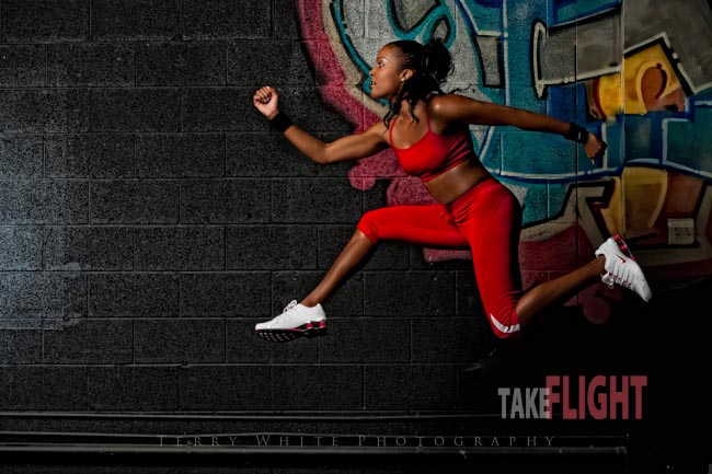
Portable Trampoline

Get Matt’s New Photoshop Compositing Book!

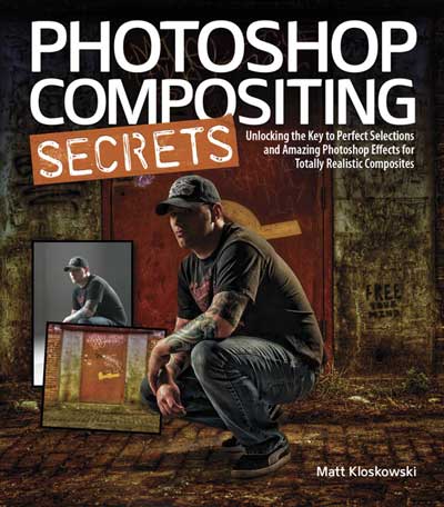
I actually entered the world of photography backwards! I knew way more about Photoshop than I ever did about photography when I started. Over the past 5-7 years I've been spending much of my spare time honing my skills behind the camera instead of saying "I can fix it later in Photoshop." With that said, I kinda left the compositing stuff behind as well. After taking a look at Matt's new "Photoshop Compositing Secrets" Book, my interest in compositing has been reignited. Now that I have a little more photography and lighting under my belt I can begin to look for not only great scenes to capture, but also great opportunities to create composites too. I never used to think about capturing shots of background images to use later in composites. Now I do!


There's an art to compositing

While technically compositing in Photoshop is simply taking two or more photos and putting them together, my goal has always been to make it look "as real as possible." That means that when a composite is done people should either look at the finished piece and not think that it's a composite or they may think it's one but they have a hard time trying to tell. That's when I know I've done it right. Matt's book exposes a lot of short cuts that I wish I had known back in the day, but glad I know them now. 

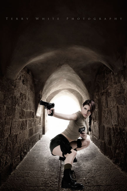
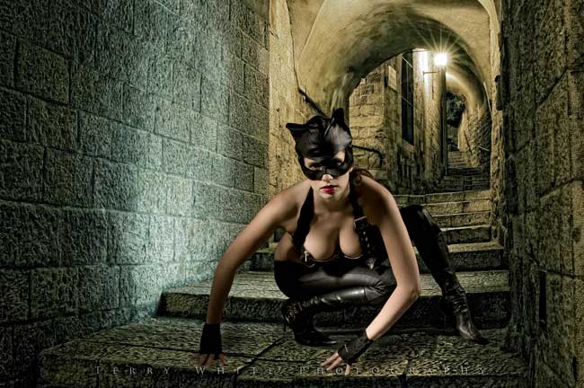
The composites I'm showing in this post are actually some of my "old" ones that I did years ago. The second one I went in and updated the color of the model that I was never quite happy with.  There are always new selection techniques to learn and new workflow steps. If you have any interest in getting better at selecting, cutting images out of the background and compositing them onto other backgrounds, then I highly recommend that you take a look at Matt Kloskowski's new Photoshop Compositing Secrets: Unlocking the Key to Perfect Selections and Amazing Photoshop Effects for Totally Realistic Composites. I have the Kindle version on my iPad and you can get it here in Paper or Electronic form starting at $21.99. Off to do more reading…

I’m on Sabbatical!

Believe it or not I'm celebrating my 15th year at Adobe and one of the perks of being an Adobe employee is a generous Sabbatical program every 5 years. By this being my 15th year I get 6 weeks off! Many say it's well deserved and I'm not going to weigh in on that one way or the other, but I will say that it's much needed!


What are my plans?

The 1st thing that people ask is "where are you going on sabbatical?" That's a good question. However, as disappointing as this sounds to many, I have no travel plans at the moment. Sure I may pick up and go somewhere cool if the mood hits me (and Hawaii comes to mind), but as someone who travels the globe over 200 days a year for a living, traveling for pleasure is not the first thing that comes to my mind. So what will I do with my free time? I'll spend most of this time with family and doing the things that I enjoy, like photography.

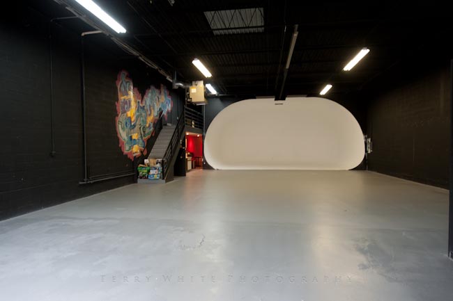
I just moved into a NEW 4,800 sq ft. studio and I'll be working on that little side project for sure. 🙂


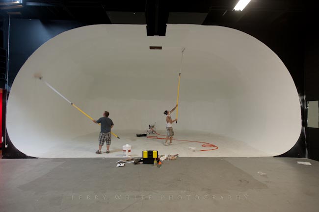
A fresh coat of paint going on by my very talented painter Chris Houghton


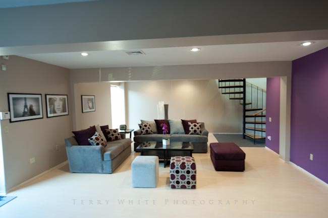
My environmental portrait area by my amazing interior designer W. Taharqa Blue is coming along nicely 🙂


What about blogging and podcasting?

Since I blog and podcast for a hobby, I don't plan on really taking a break from it. However, I will say that for the next 6 weeks I won't stress over not having a post ready every day/other day. So if I go a couple of days without posting here and there, you'll understand. My first official day back to work will be when I get to Photoshop World Vegas.

Look for studio updates, photos and of course gadget reviews as I have them.

Cheers and Happy Monday!

Slickr Flickr Pro for WordPress

[slickr-flickr tag=”Australia” type=”slideshow” delay=”6″ items=”33″ size=”large” width=”650″ height=”488″ border=”on”]

I'm still trying out different methods of posting multiple images to my blog. Last week I showed you the extremely cool LR/Blog plug-in for Lightroom that allows you to post images directly from Lightroom to your WordPress blog. While the LR/Blog plug-in does exactly what I want it to do when I have a few images here or there to post, I was looking for another solution to post a "gallery" of images. Ideally I wanted to take the photos that I post to Flickr.com and have them displayed on my blog. This would make my life even easier since I can post to Flickr directly from Lightroom 3 anyway.


Flickr already does this

If you have a Flickr account you can set it up so that you can post a photoset directly from Flickr to your Blog! See an example here. However, there really isn't much control over it and it's IMMEDIATE! The minute I clicked "Post", it made a new blog post and released it without any warning. Again, there is nothing wrong with this and for many this simple solution will be just fine. As a matter of fact I could so see doing this while on the go or when returning from a photowalk and just letting the image rip! However, if I'm writing a more detailed post and I then want to include the images in that post then I require a little more control over layout, delivery and timing.


WordPress Plug-ins for Flickr

I started looking a few different WordPress plug-ins. Sadly almost all of them disappointed me in one way or another. Either they didn't allow me to simply choose a photoset (Flickr's term for a gallery) or they looked like crap in terms of display. I settled on Slickr Flickr Pro (at least for now). This plug-in offered the closest set of features to what I was looking for. While it oddly doesn't allow you to specify a particular photoset, it does allow you to select images via Tags. If you want to include a selection of images in a post, just tag them all with the same Tag and Slickr Flickr will use those images. 

You can display the images as a gallery (like my Australia Post) or you can make a self running slideshow like my images above. The Pro version allows you to go past the image count limit as well as it offers more customization features and better support. This is not the end all be all solution, but it works for now.


Yes I am actually in Australia

I took the photos above the last time I was here in 2007. I haven't had many photo ops on this visit, but I am looking forward to seeing you in Melbourne, tomorrow!

CS5 Evolution Tour

5 Lightroom Keyboard Shortcuts that will Speed Up Your Workflow

httpv://www.youtube.com/watch?v=8Sud57DpfgE


In this episode of the Adobe Creative Suite Video Podcast I'll show you 5 Keyboard Shortcuts for Lightroom that will speed up your day to day workflow!

See more of my Adobe Creative Suite Videos on my Adobe Creative Suite Podcast and get the App here. It features EXCLUSIVE CONTENT that no one else gets to see. This episode not only has a BONUS CLIP that is available only in the App, but it also has an EXCLUSIVE PDF with tons of Lightroom Keyboard Shortcuts:

Learn Adobe Creative Suite with Terry White - Wizzard Media


Hey! Are those my images in the NEW 2011 Westcott Lighting Solutions Catalog?


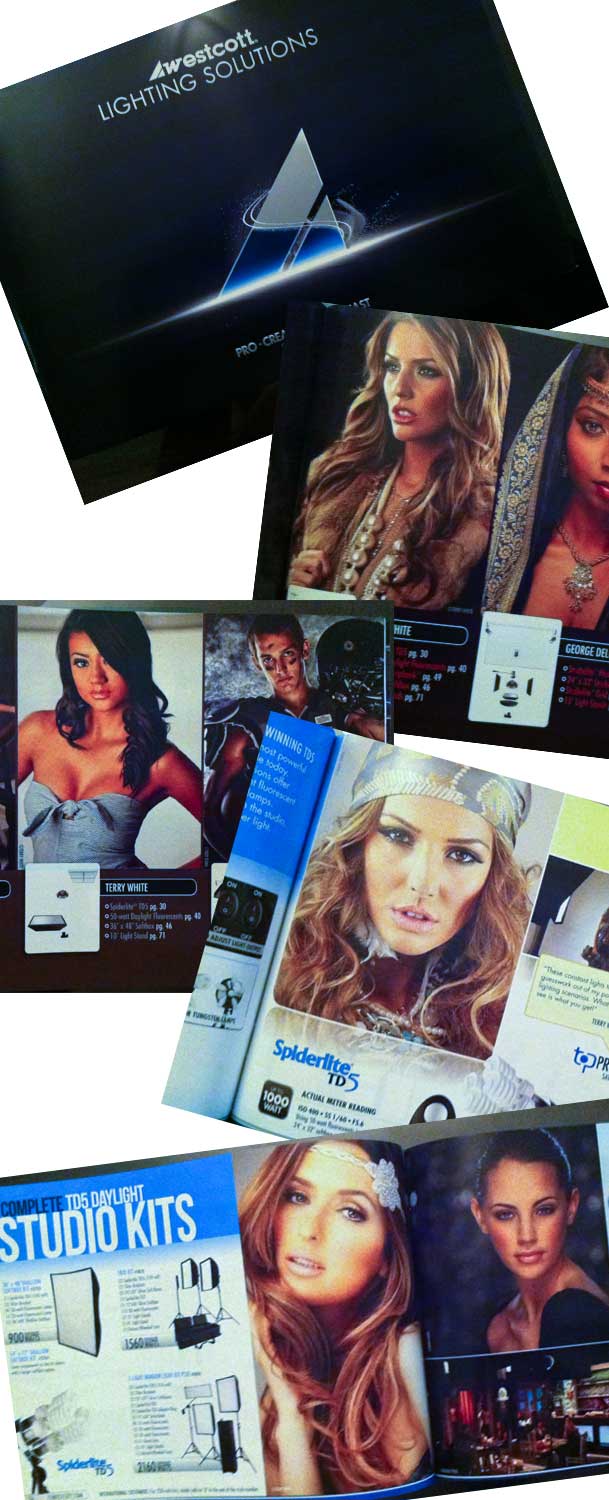
One of things I look forward to every year is the NEW Westcott Catalog! I've been taking my photography more and more seriously over the past couple of years and when a well known company chooses to use one of my images to represent their products, that's a big thing for me. I got a chance to pick up a copy (ok several copies) of the new Westcott Lighting Solutions Catalog here at Photoshop World. Needless to say that I was deeply honored to have not just one image in the new book, but six of my shots featured. Wow! The crappy iPhone shot of the catalog above doesn't do this book justice. Stepping aside from looking at my own images for a minute, this is by far the best version of their catalog yet. There are not only tons of great images from some of the top photographers in the world, but also the book has a new format, layout and it just looks awesome overall!

The NEW catalog is not yet up on their website in PDF, but as soon as it is you'll be able to grab a copy here. If you are here at Photoshop World this week be sure to stop by their booth and pick up a copy.

Don't forget to check out my shots from the Photoshop World Project Runway Keynote.

One more thing….

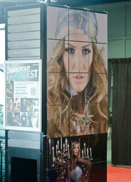
I was also very thrilled to see my images on their booth too! Woot!

I also have to thank my great models: Aferdita, Cecilia, Lauren, Tika and makeup artist Renata.

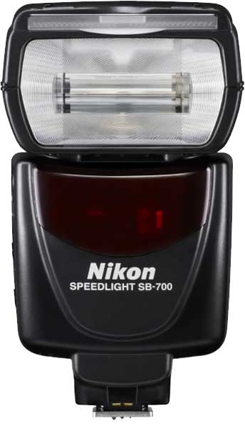
Nikon SB-700: Guest Review by Jason Lykins


I love the Nikon CLS flash system. For me, it is THE reason to choose Nikon over any other brand. Their R&D, fit and finish, and performance are second to none in the small flash arena. For a few years the SB-800 was the go to flash for me, offering the control, and power needed for a working professional. Recently Nikon updated it’s flash line; first with the flagship SB-900 replacing the SB-800, and more recently the SB-700 replacing the SB-600. I am currently using SB-900’s as my go to main flash units, but when my last SB-800 died I decided to take a look at the new SB-700 as an alternative. After reading David Hobby’s (aka the Strobist) initial review of the flash I decided to give it a go. After a couple of weeks with it, I’m not only impressed, but sold on this unit. I’ll be buying more.
 

What it had to have

There were a few things that this flash had to have to make it useful for me. The first and most important thing that I need is power. I often double, and triple diffusing my flashes to increase the quality of light. This requires a lot power to shoot through all of these layers of diffusion and still have enough “oomph” to light the subject. The SB-700 has power to spare. After shooting it side by side with a SB-800 I’m pretty sure that the power output is on par with that unit. Of course I didn’t do a scientific comparison to measure this, but just the light output, the coverage, and the recycle times make me think that this flash is right there with the 800. Nikon claims not, but I have to think that the low power rating by Nikon is to drive pros to the SB-900 over the 700. Suffice to say that this flash meets my power and output needs without a problem.


The next thing on my list of must have’s is control. I need to be able to control wireless flash systems just as I would with the SB-800 if I’m going to be using these flashes as replacements. The SB-700 gets part of the way there. Let me explain. Nikon did a great job by putting a lot of the controls on the outside of the flash similar to the SB-900. They placed a rotating switch similar to the 900 for TTL, remote, and Master selection for the wireless CLS system. While we’re on this subject, the 700 can act as a Master flash for the CLS system, but only offers two groups. For me this isn’t a big deal because I use them with the Pocket Wizard Flex units, which allow me to add that control externally anyway. The 700 also adds a physical switch to the back of the unit to select your mode. With the option of TTL, Manual, and guide number, it has every option that I would want. Another Physical switch added to the back of the flash is the light output type (standard, even, and center weighted). The FEC (flash exposure compensation) for your main unit, and the remote units when in master mode is controlled just like the SB-900 with a quick button push and a spin of the wheel. If you’re already accustomed to the SB-900 controls, you will feel right at home.

The reason that I said Nikon only get’s part of the way there on the control has to do with the way it handles it’s wireless flash units. With the 700 in master mode, the remote flash units are set to the same flash exposure mode as the 700. This means that if you are using TTL for the main on camera flash, you can’t set the remote units to anything else. For most this probably won’t cause a problem. For me I want to make my remote flashes different exposure control than my master sometimes. Sometimes my subject is being lit with TTL, but in the background I want to add a small amount of kicker light with a gel. The SB-900 allows for this independent control of the wireless flashes, but for whatever reason they excluded it from the SB-700. To work around this, I use the SU-4 mode to trigger the background lights instead. Speaking of SU-4 mode, it works remarkably well on the 700. Nikon flush mounted the light sensor for triggering making this thing super sensitive. When I say sensitive, I mean SENSITIVE. It picks up any little glint of flash and triggers it.
Continue reading “Nikon SB-700: Guest Review by Jason Lykins”

The Online Lighting Diagram Creator

I'm terrible when it comes to documenting how I lit a shot. My lighting setups are not that complex, but when someone asks me how did you light that shot the first thing that comes mind is "very well, thank you." Of course I'm totally kidding here, but I do cringe when I think about trying to explain it to them. Luckily there are a couple of solutions out there now that will make it much easier for me and you to explain the setups that we use to someone visually. 


The Online Lighting Diagram Creator

is a website that gives you drag and drop items from a range of categories to build your diagram right there on the spot. You can then export the image out and send it to someone. This site is free to use for your personal use. If you have a commercial use (you're writing a book or teaching a paid class, etc.) then you should contact them to work out how best to compensate them for use of their technology. The images you export will have their copy right info on the bottom, which I don't have a problem with.

You can try out LIVE below or on their site: The Online Lighting Diagram Creator here.


Strobox for your iPhone


Strobox is another Free solution for your iOS device. Like the solution above it has built-in popular lighting pieces that you can drag around on your display and then save. You can either email the diagram you create directly from the App or save it to your camera roll.

You can get Strobox for FREE here from the Strobox - Janis Lanka