Adobe Creative Cloud Market is Here

creativecloud_market

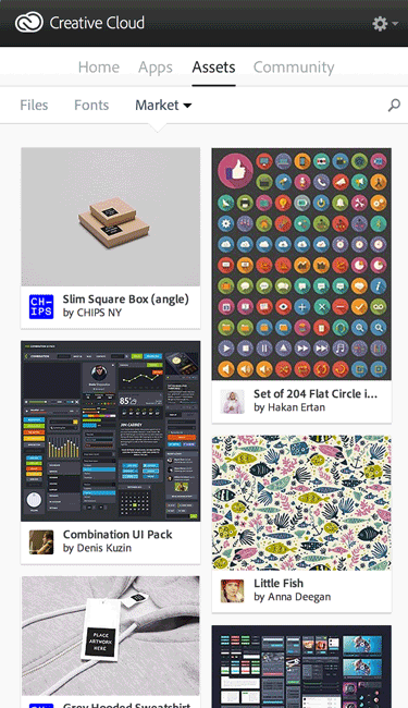
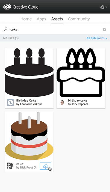
One of the features shown during the Keynote Address for the 2014 Release of Creative Cloud was the new Adobe Creative Cloud Market. These assets are licensed for Creative Cloud users to use royalty free in their design projects. All you have to do is run the update to your Creative Cloud desktop application and the new “Assets” tab will be there.

creativecloud_market_search_cake

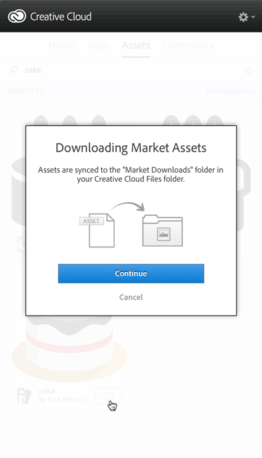
You can either browse the assets there are featured or you can do a search for keywords. If you find a piece that you want to use, just click the sync button.

creativecloud_market_sync

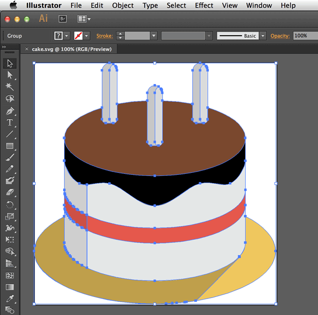
The asset you choose will then be sync’d down to your hard drive in your Creative Cloud files folder in a new folder called “Market Downloads”. I downloaded a vector file for a cake. It arrived in .SVG format and I was able to easily open it in Adobe Illustrator CC and access the vector points and curves to alter it if needed or to save/export it out in a different format for use in other applications.


creativecloud_market_asset_vectorinAI

The selection is a bit limited on this opening day, but I expect it grow as more art is licensed along the way. This is a nice plus to the Creative Cloud membership.

Photoshop for Photographers Program

photo by Victoria Pavlov

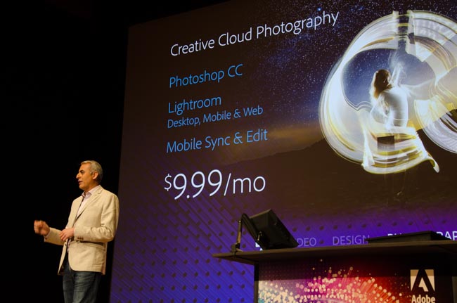
One of the things you may have overlooked in the midst of all the Creative Cloud announcements on June 18th was the fact that the Photoshop for Photographers Program, which was a limited time offer that kept getting extended has now spawned a permanent offer (now called Creative Cloud Photography). That’s right, even if you never owned a license to Photoshop or Lightroom, you can get:

  • Adobe Photoshop CC
  • Adobe Photoshop Lightroom 5
  • Lightroom Mobile and Web with unlimited photo syncing
  • 2 GB of Cloud Storage to optionally to use anyway you want (LR mobile doesn’t use this storage).

for only $9.99 a month. This means you also get access to all the feature updates along the way at no additional cost. The original offer was such a success that it kept getting extended and Adobe just decided to go ahead and make it a regular plan of Creative Cloud.

You can learn more or sign up here.

Watch the Keynote for the 2014 Release of Creative Cloud


Logitech Ultrathin Keyboard Folio for iPad Air Review

wpid13517-IMG_2016_sm.jpg

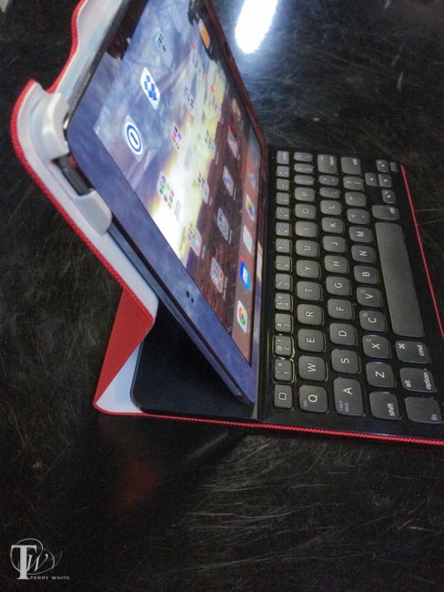
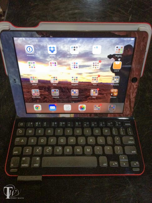
Having been a fan of the Logitech Ultrathin Keyboard Covers for my previous generations iPads, I was more than just a little interested in their new additions. I didn’t even know that this new had come out until my buddy Jason Levine got one for his new iPad Air. I spent a few minutes with his and I could easily see how much of an improvement it was over the older design. While the older designed magnetically attached to your iPad, it really offered no protection to the back whatsoever. This new “folio design offers scratch protection to all sides of your iPad Air (or iPad mini) and gives you a nice Ultrathin Keyboard to boot. The reason I went with the Ultrathin Keyboards from the beginning is because I felt all other keyboard cases were just too bulky and unattractive. The Ultrathin Keyboard Folio feels nice in my hands and is not too thick.

wpid13519-IMG_2015_sm.jpg

How does it work?

You simply snap your iPad into the Keyboard Folio and turn it on. Mine showed up immediately in the iPad’s bluetooth settings and connected. That’s it. When you stand the iPad up it magnetically snaps to the keyboard and can begin typing. The keyboard keys are layed out about as comfortably as I would expect and gives me the all important Shift key on both sides that many iPad keyboard lack. The number keys also serve dual duty with the Fn button allowing you to do things like change the iPad volume and fast forward or rewind movies. You can even use the Command key as you would on a Mac for things like Command-C to copy or Command-V to paste.

wpid13515-IMG_2017_sm.jpg

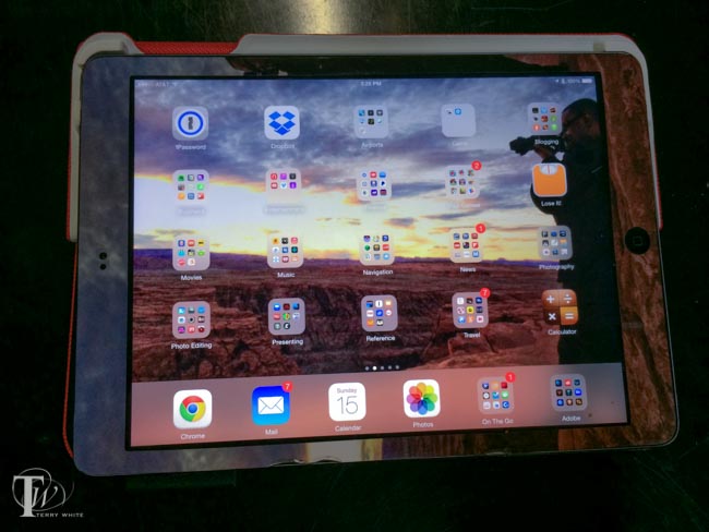
I love the fact that you can lay it down on top of the keyboard for those times when you want to play a game or draw on the iPad and you don’t need a keyboard. With the old Ultrathin cover there was no way to do this other than disconnecting the keyboard and laying it aside. There’s even a holder for a stylus built right in. The battery life is rated at 3 MONTHS per charge! That’s with an average of 2 hours per day of use.

Good, but you can’t have everything

One thing I do miss with the older model is the ability to stand the iPad up on the keyboard in portrait/tall orientation. There’s no way to do that with this folio model.

Did Logitech address a potential design flaw?

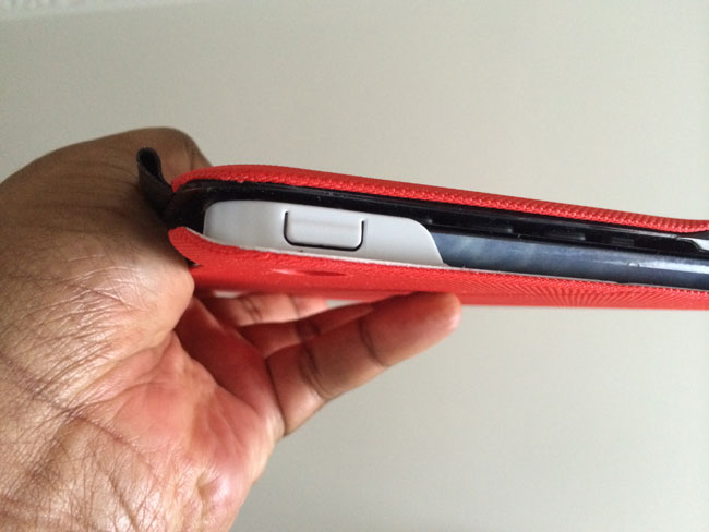
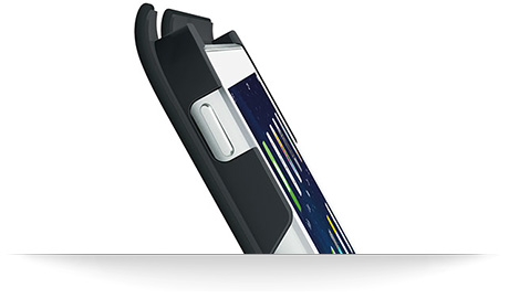
If you go to Amazon and read the reviews you’ll find several that complain about the the upper left support cracking after a short amount of time. I noticed that on some the upper left support is “cut out” revealing the iPad power button (see the very first picture in this post). I’m guessing this is the “newer” model because it’s the one that Logitech features/pictures on their site.

logitech_ultrathin_keyboard_folio_crack

The older perhaps flawed model has a complete cover over the iPad power button. This is the one I have, so I’ll be monitoring it closely. Clearly there are two versions of this model and I’m guessing the one with the cutout (picture’d below from the Logitech site and at the very top of this post on a friend’s cover) is the newer one that solves the problem. There doesn’t appear to be a problem with the version for the iPad mini.

logitech-ultrathin-side

Note the stylus holder on the right in the image below.

wpid13523-IMG_2013_sm.jpg

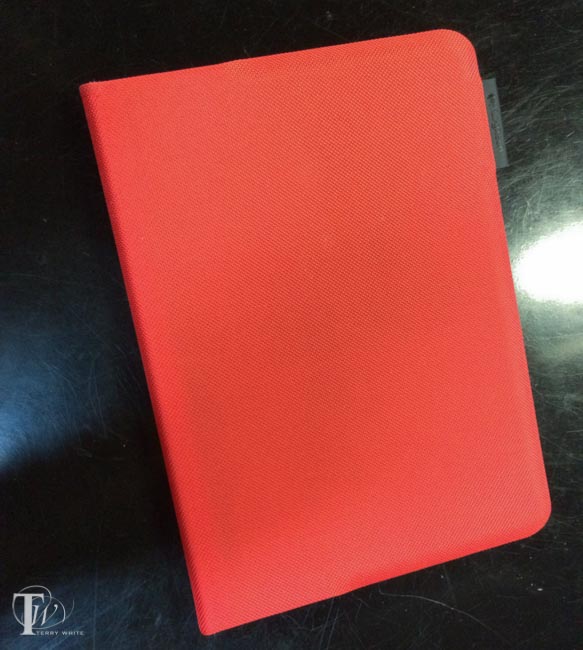
They are available in multiple colors.

You can get the Logitech Ultrathin Keyboard Folio for iPad Air here.

You can get the Logitech Ultrathin Keyboard Folio for iPad mini here.

Beautiful Catchlights with the NEW Westcott Eyelighter

wpid13556-KandiceLynn34-0036-Edit_sm.jpg

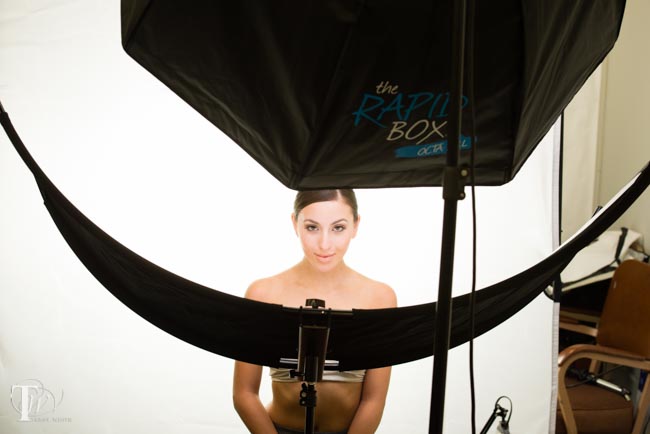
Anyone that knows me knows that I love beautiful light when it comes to photography. Therefore I use quite a few light modifiers. When it comes to interesting catchlights I had been using a Triflector. While the Triflector does create an interesting light pattern as well as providing good reflection backup up to a subject’s chin, neck and chest, it’s a broken pattern. This is due to the fact that it uses 3 reflectors, hence the name Triflector. Westcott has started shipping the long awaited Eyelighter. As you can see from the photo above the Eyelighter is one big continuous reflector that has a nice crescent shape. This creates not only a nice reflection of light under the chin, but it also creates great crescent shaped catchlights under the eyes.

wpid13554-KandiceLynn34-0172-Edit_sm.jpg

This is why Westcott called it the “Eyelighter” and I LOVE IT. When I first saw it in person at Photoshop World it didn’t seem that large. Even when I received the box the box appeared to be pretty compact. However, once I got it setup I was quite pleased by the size. It provides a very nice soft reflection under the subject. In the photo above I used the one light, a Westcott Skylux continuous LED light with a large Rapidbox Octa XXL softbox.


The Bottom Line

No single light modifier works for every situation. However, since I do a lot of portraits and beauty work, I’ll be using the Eyelighter more than most of my other modifiers. The results exceeded my expectations. You can order the Eyelighter here.


Why do I have 2 copies of my CC Apps?

duplicate_cc_apps

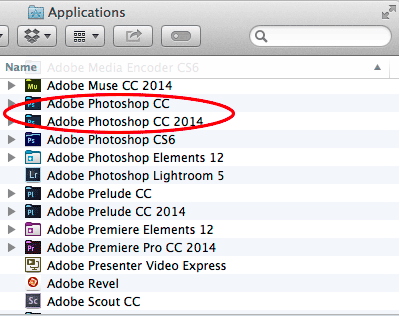
With the release of the new Creative Cloud 2014 versions of your favorite Adobe applications, some have been asking the question as to why for example do they now have a Photoshop CC 2014 AND a Photoshop CC in their Applications folder? Do I really need both? These are good questions and hopefully with this post I can help shed some light on this mystery for you.

First off with the release of the CC Applications last year, you potentially had both your CS6 and your CC applications installed. That was until YOU decided to uninstall the CS6 applications that you were no longer going to be using. From that point on, each new feature update or bug fix merely updated the application (binary) that you already had installed. For example, in the January update of 2014 you got new features in Photoshop CC and after the update you launched the same Photoshop CC that you had always been launching. This is the way Creative Cloud is supposed to work. However, there are times during the course of development that new features require a file format change. Those that use InDesign are used to this. Since day one each new major version of InDesign meant a new .INDD file format. There are also times during the development process that the engineers start with a clean slate. This was the case with each Adobe application that made the move to be 64bit (Photoshop, Illustrator, InDesign, Premiere Pro, After Effects, Bridge, etc.). This required a brand new rewrite and therefore a brand new binary. This is also the case this time around with Adobe Muse CC 2014. It’s a brand new native 64bit application for both Mac and Windows. It would have been impossible to update your existing Muse binary.

There’s another factor…

In the past educators and authors wrote their courseware and books based on the “NEW” version. With the Creative Cloud model of applications being updated with new features as soon as those new features are ready wreaks havoc on authors. At what point do you write your new book? How well will the “Adobe Muse November 2013 update” book sell? While Adobe hasn’t announced an “annual” plan to update all the binaries of each application, Adobe has chosen to do it for 2014. This means that each of your CC 2014 versions are new binaries and therefore a clean slate for the next round of regular feature updates and bug fixes for each of the applications. It means that an author can write the “Adobe Illustrator CC 2014” book.

Do I need to keep both versions?

Nope! Just like when you went from CS5 to CS6 to CC, you are free to UNINSTALL the previous versions of any applications that you no longer use. The CC 2014 versions are NOT dependent on the previous versions. However, you may want to do the Uninstall of your CC versions AFTER you have the CC 2014 versions installed, tested and you’re happy as many of the applications will automatically transfer your settings over from the previous version. For example, InDesign CC 2014 now has a “Seamless Update” feature that copies your settings and presets over from your previous version upon first launch. If you had uninstalled the previous version AND removed the preferences from it there would be nothing for the new version to update from.

What about my plug-ins?

Adobe recommends that you reinstall your plug-ins from their original installers. This is the cleanest way to do it and will likely result in less problems as each plug-in is different and may be dependent on being installed properly from the installer. However, my buddy Glyn Dewis has a blog post here on simply copying the plug-ins folder from the previous version to the new version.

How do I uninstall the older versions that I don’t need?
uninstall_prelude

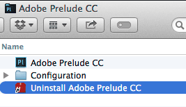
Each CC Application has its own uninstaller. It’s usually located in the same folder as the application itself (Muse CC may be in your Utilities folder on the Mac). Launch the Uninstaller and it will walk through the process and remove the older version.

What if I need to reinstall an older version later?
install_previous_cc_version

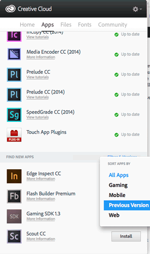
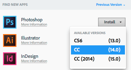
One of the benefits of Creative Cloud is that we’re archiving the older versions for you all the way back to CS6. You can install and older version any time you you need and now you can even do it from the Creative Cloud Desktop App. This works even if you never owned CS6 or you came into Creative Cloud after the CC 2014 versions and never had the CC versions before.
install_previous_cc_version2


The Bottom Line

While this may seem like an inconvenience or maybe even a hassle it’s designed to prevent breaking people’s workflows. If we automatically uninstalled your previous versions before you had tested the new versions in your critical workflows you wouldn’t be very happy. This way you remain in control over what you install, when and more importantly what YOU no longer need and uninstall when YOU’RE ready. Also note that not only can you have these apps installed on up to two computers, but you can install older versions on an older computer (of your two computers).  Lastly, you definitely want to take a look at the NEW product pages on Adobe.com which feature brand new (by date) “What’s New” feature pages. In case you missed it, check out my Creative Cloud Learning Center to see the new features for the CC 2014 Design and Photography apps.


See What’s NEW in Adobe Photoshop CC, Illustrator CC, InDesign CC, Muse CC and more for 2014!

ccbg2014

Today Adobe is taking the wraps off updates to 14 Adobe Creative Cloud applications in the 2014 release of Creative Cloud. Also Adobe is introducing its first hardware product ever and new iPad and iPhone apps. There is so much innovation and cool stuff going on today and I’ll be on stage LIVE at 1PM ET to show it. However, since I figured you probably just can’t wait that long to see it all, that I share some of my favorites below in video form.

What’s New in Adobe Photoshop CC 2014

What’s New in Adobe Illustrator CC 2014

What’s New in Adobe InDesign CC 2014

What’s New in Adobe Muse CC 2014

Introducing Lightroom Mobile for iPhone


Get Lightroom Mobile for iPhone here: iTunes.

Get Lightroom Mobile for iPad here: iTunes.

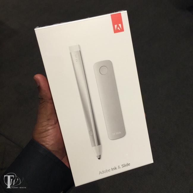
Introducing Adobe Ink and Slide as well as two NEW iPad Apps: Line and Sketch

wpid13512-IMG_1810_sm.jpg


Get Adobe Line for iPad here: iTunes.

Get Adobe Sketch for iPad here: iTunes.

Introducing Adobe Photoshop Mix for iPad

Get Adobe Photoshop Mix for iPad here: iTunes.

Exclusive Two Day Deal! Save $50 on Adobe Creative Cloud !

Adobe Creative Cloud 1-Year Subscription

$50 off ::  Final price $549.95

Adobe Creative Cloud 1-Year Subscription Student & Teacher Edition

Price drop from $346.95 to $246.95

adobe-50off-2


See the current flow as you Charge your iPhone or iPad

joltz_pulsating_lightning_cable

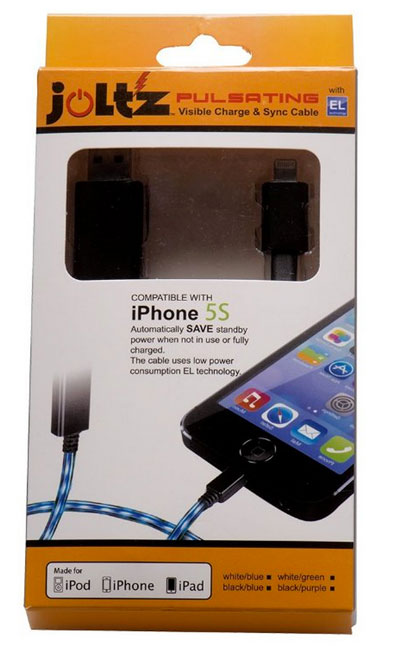
The last time I was in Atlanta for Photoshop World  I took an Uber car from the airport to the hotel. I couldn’t help but notice the cable the driver was using to charge his iPhone. The reason it stood out is because it had a stream of pulsating LEDs that animated from the USB power supply to the iPhone. This obviously doesn’t charge the device any faster, it’s just cool to look at. I had forgotten about it for a while and then I remembered the cable and found out who made it. Joltz makes a Lightning cable version of this. On the USB side the connector is longer than usual and I’m guessing it houses a chip to control the animation of the LEDs along the cable.

Here’s how it looks in action:

https://www.youtube.com/watch?v=ZMh20wUUdVQ

When the cable is not connected to the iDevice the LED light pattern just sits still and eventually turns off/goes to sleep. I like the cable a lot and my only wish is that Joltz would make a longer version. This one is only 3 feet long.  Charge your iPhone, iPad or iPod touch in style.

You can get the Joltz Pulsating Lightning cable here.

My Favorite Smartphone Car Mount Now in White – Kenu Airframe

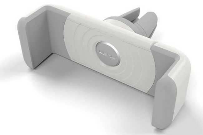
kenu_airframe_white

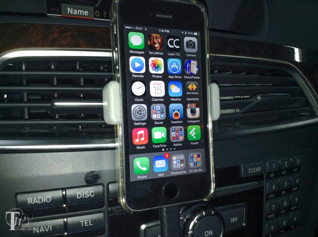
I use the Kenu Airframe everyday in my car. It’s attached to one of my center vents and I’ve been very happy with it since day one. It’s very small, pocket sized and spring loaded to make it easy to place my iPhone 5s or remove it with one hand. I have a second one in my suitcase for travel and use in rental cars. I’ve been able to use it every car I’ve tried to date. When I did my original review  last year, some questioned the negative effects of heat coming from the vents. First off I never have heat coming from the top vents. When I use the heat it’s set to blow from the floor vents. In the summer the top vents blow cold air from the air conditioner and I’ve had no problems thus far. Also some were concerned that it would block the vent and that is possible on cars with smaller vents. However, in most cars you can turn off individual vents if you’re concerned with the cold/hot air hitting the back of your phone. As far as blocking the vent there isn’t much you can do about that other than perhaps keeping it in the the vertical position.

wpid13531-IMG_0002_sm.jpg

As you can see above I have the Kenu Airframe mounted with my iPhone 5s in the vertical position. You can simply rotate the phone as the mount is design to turn 90 degrees to allow for a horizontal display.

wpid13529-IMG_0015_sm.jpg

The Kenu Airframe opens wide enough to accommodate both my iPhone 5s and its case. This is a must as I would not want to have to take the case off each time I got in the car. The new white model shares the exact same design as the original black one.

You can get the White Kenu Airframe here

You can get the Black Kenu Airframe here.

You’re also going to want one of these.

Traveling by plane with your camera gear

Recently a fellow photographer asked me about flying with her camera gear and what was allowed and what wasn’t? Since I fly for a living and I usually have at least one camera with me I’m pretty familiar with the rules and thought I’d share some tips here. First I have to give you a disclaimer in that TSA can decide to search any of your baggage at anytime and ask you  to take out every single item one-by-one for inspection. I’ve had it happen! Now with that out of the way luckily this is not the norm. Let’s go over some quick tips on carry-on vs. checked luggage. I absolutely HATE checking my luggage and only do so if I have no choice. This means that I want to carry both a camera bag AND a computer bag on board and therefore I will check the 3rd piece of luggage containing my clothes. Under no circumstances am I ever ever ever going to check my camera or computer gear. It’s like waving good-bye to it as I feel like I’d never see it again. If I have to check my camera gear, then I’m not going! Most airlines allow you one piece of carry-on luggage such as a roller-board suitcase and a personal item such as a backpack, briefcase or purse. For me that means a backpack.

A Quick FAQ

Q. Do I have to take my cameras out of the bag when going through TSA security?

A. Typically NO, but TSA at any time can ask you to take ANYTHING and EVERYTHING out of your bag. With that said I can’t remember the last time they asked to take my cameras out. It’s been years. This of course goes out the window outside the US. Foreign airport security is a lot less forgiving. Give yourself time as you will likely need to take out each piece of gear and put it in a bin.

Q. Should I just check my camera gear under the plane to save the time and hassle.

A. NO! You may never see it again if you do and the airline will NOT replace it.

Q. What about tripods/monopods?

A. I have been known to travel with a tripod from time to time and I put it in my larger roller-board suitcase with my clothes. This however, is a grey area. Some TSA checkpoints will let it go and others will require that you check it as a tripod could be used as a club/weapon. So be prepared with extra time if you’re traveling with a tripod and have it in a bag that you don’t mind checking (not with the rest of your camera gear).

The backpack pictured above is my BIG ThinkTank “Street Walker Hard Drive”  Backpack. This is the one I carry when I’m going on a trip specifically to shoot and I’m going to carry a LOT of camera gear. This one backpack also holds my MacBook Pro 15″ Retina notebook and iPad Air. It weighs a freaking ton once I have I have it loaded, but it still fits under the seat in front of me on a plane and therefore allows me to carry a rollerboard on with my clothes (and tripod) in it.

On trips where I’m carrying less photographic gear but still more than two lenses then I carry my smaller “Kata” backpack:

kata

This one will still hold one camera body and 2-3 lenses plus my MacBook Pro. Also since it’s smaller you’ll be less likely to load a ton of gear in it and therefore it will be lighter to carry and manage.

Although both backpacks above  are great for those photo specific trips I go on, neither of them are my “regular” backpacks. Since most of my trips are not photo specific I’m usually carrying only one camera body (my Nikon D600) and one lens (my Nikon 28-300mm) or my even smaller Sony Alpha NEX-3N. My daily/weekly travel backpack is actually my Tumi Alpha T-Pass Laptop Backpack.

tumi_alpha_t-Pass_backpack

I really like this backpack A LOT! The T-Pass stands for “TSA Friendly” in that the back containing your laptop can unzip so that you can lay the bag flat (open) without having to remove your laptop saving you time. Tumi bags are expensive, but they come with a 5 year warranty and are very very very well constructed. I use this bag daily and it shows no signs of wear after one year so far. There is plenty of room in it for my laptop, iPad, camera stuff and just a ton of other little items that I carry. It weighs a ton once I load it up, but it handles the load very well.


The Bottom Line

For the most part you should be fine traveling by plane with your camera gear and carrying it on as long as your carry-on bag meets the size restrictions for the overhead bin or under the seat. TSA sees cameras everyday and while they still require you to take your laptop out and put it in a separate bin (unless you are TSA Pre-Check or you have a bag like my Tumi above), they tend to not ask you to take your camera gear out. The only other thing they can be uptight about is carrying a lot of batteries. So keep your extra batteries to a minimum and spread them across multiple carry-on bags as best you can.

W-camera-gear


5 Things You Need To Know About Photoshop Layers

PS_CC_totem


In this episode of Adobe Creative Cloud TV, I’ll show 5 things you need to know about Photoshop Layers that will speed up your workflow and make it possible to be more creative and organized.

Are you missing out on my Bonus Content?

See more of my Adobe Creative Cloud Videos on my Adobe Creative Cloud TV and get the App below. It features EXCLUSIVE CONTENT that no one else gets to see. This episode has a BONUS CLIP that is available only in the App! My iOS App is a Universal App for iPhone, iPad and iPod touch. I also have an Android version on the Amazon App Store:

.