Lightroom 2 Has Shipped!

I couldn’t be happier that Adobe Photoshop Lightroom 2.0 has shipped! As many of you know Lightroom 2 has been in public beta since early Spring. This new version boast several features that make Lightroom (LR) much more approachable and powerful. When the beta first came out I did a video on the NEW features. There have been a few new features and refinements added since the public beta. I just created a NEW video showing how you can now do some basic portrait retouching right in LR with the New Adjustment Brush! This brush allows you to do localized corrections (corrections on specific areas of the photo utilizing automasking). It’s really amazing! The good folks over at NAPP have launched a Lightroom 2 Learning Center! Be sure to check it out. It’s free!


What’s cool?

LR 2.0 remains a completely non-destructive editing app. You can work with JPEG, RAW, TIFF and PSDs. Speaking of RAW, there is (unoffcial) support for the hot new Nikon D700 which just shipped! How’s that for timing?

New in Lightroom 2.0

Library Module

Streamlined Organization and Worfklow

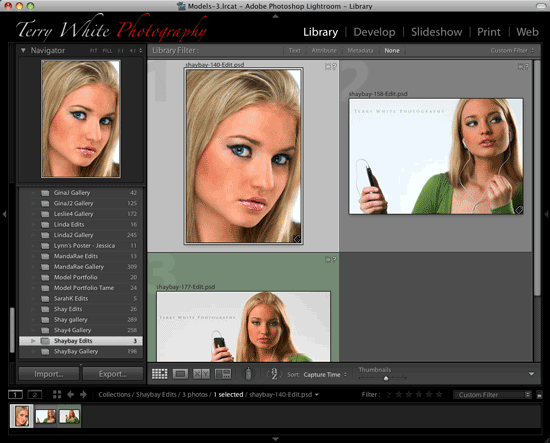
Layout: The entire Library layout has been revisited to provide a more intuitive image organization experience.  The left hand panel of the Library has been streamlined to include only the most relevant image sources: the folders the images are physically stored in and collections of images that the photographer creates.  

Folders:  
Photographers working across multiple hard drives will find that the enhanced volume and folder layout will make it a much more intuitive experience to manage images on one or many hard drives.  The volume indicators clearly indicate the hard drive that you’re working with and provide the option to show the online/offline status, the amount of space available, the number of photos you’re working with and there’s an indicator light that migrates from green to red as your hard drive fills up. Now it’s visually much easier to move your images from hard drive to hard drive and understand where your images are stored when a external hard drive is no longer connected.

Collections:
The Collection panel has received significant attention with the addition of improved iconography and collection sets that allow photographers to create a hierarchy while maintaining collection-specific sort order. (Hierarchical collections have been removed in order to support the new organization model and will be migrated appropriately from 1.0 to 2.0 libraries)  There is also the ability to save output specific collections for Slideshow/Print/Web.  This can be accomplished by creating a new collection item while in the specific output module.  The subsequent icon in the collection panel will provide a quick reference and link to the images and output settings you created.  Collections still maintain their auto-save capabilities when it comes to on-the-fly output creations that don’t require a persistent entry in the Library.  

Smart Collections
are now available.  Specify the criteria for a smart collection and images will be automatically added to the collection if they meet the criteria. An expert user tip: Try alt/option clicking when adding a new search criterion.
 

Target Collection
functionality allows you to specify any Lightroom collection as the destination of the quick collection shortcut key, B.

Filter Bar:
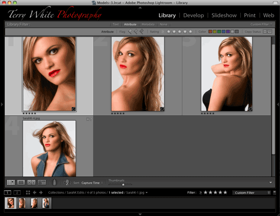
 With the source location of the images clearly defined in the left hand panel, the top of the grid view provides a panel that will filter the content.  Use the ‘\’ key to hide or show the filter functionality and expand one section at a time to filter the content.  Each category below can be toggled on or off by clicking on the name and multiple filter categories can be shift-selected to provide additional control.
Text: Search across your images using text search field
Refine: Filter your grid view by flags, star ratings, color labels and the type of file, Master or Virtual Copy. This functionality was previously located only in the right hand side of the filmstrip.  It still remains in that location now labeled ‘Filter’ as a quick tool that can be used in any module.
Metadata: A wide range of metadata is now presented in easy to browse filter columns that can be added, removed and customized per your organization workflow.  Choose the field to filter on by clicking on the column header and select menu icon at the right side of each column to add or remove a column.   The column arrangement and selection can be stored as a preset that is defined in the upper right hand corner of the filter bar.  Note that the Date and Location fields contain the option to show hierarchical or flat representations of the data.  The Date field also includes the day of the week in addition to the numerical date.
 
The Keywording pane has a new Keyword Set called “Suggested Keywords.” Keywording is simplified through Lightroom’s ability to suggest keywords for the current image based on existing keywords applied to that image as well as keywords applied to images that are close neighbors in terms of capture time.  For example, if a number of images in a catalog contain the keywords dog and beach, an image assigned the keyword ‘beach’ will cause the suggested keyword panel to automatically update to show ‘dog’ as a suggested keyword. The Keywording panel also includes a dedicated keyword entry field below the larger box that displays all of the assigned keywords. The Keyword List provides a convenient filter to help find and manage your keywords. Checkboxes are available to quickly apply additional keywords to the selected images and arrows to the right of each keyword are a link to view all of the images tagged with that keyword.

Multiple Monitors:
Lightroom 2.0 beta offers a dual monitor solution that can adjust to fit your particular monitor set up.   The main Lightroom window that includes the Module picker can be positioned on either monitor and the following views can be provided on an additional monitor. To activate a multiple monitor environment, choose the monitor icon in the lower right hand side of Lightroom, just above the filmstrip.  If a second monitor is not attached, a second window will appear on a single display.

  • Grid: Place the grid on a secondary monitor for quick image selection while the develop module is displayed on the other monitor.  Or use the grid to reorder images while creating slideshow, print or web output.
  • Loupe:  Allows an image at a preferred zoom level display on an alternate monitor.  
    • In Normal mode, the image displayed on the alternate monitor is changed when the selection is changed in the primary Lightroom window.
    • Live mode is continually updated based on the image and area of an image the mouse is currently hovering or passing over.  Zooming to a 1:1 view allows for quick focus checking across a number of images displayed in a grid view on the primary monitor.
    • Locked mode fixes the image displayed on the alternate monitor until you wish to change the selection by selecting alt/option-Enter to make the current selection visible.
  • Compare: Offers the same powerful compare functionality previously in the Library but can now be used to compare images while selections are made in the grid view in the Library or while adjustments are made in the Develop module.
  • Survey:  View multiple images at once while organizing or adjusting in another display.


Photoshop Integration:  
Lightroom can now open images directly in Photoshop without writing out TIFF or PSD files first. The previous ‘write file to disk first’ behavior was inefficient and the new behavior enables a faster a more functional workflow that includes:

  • Open files in Photoshop as a Smart Object: Utilize the non-destructive smart object workflow by opening the image as a smart object directly into a Photoshop document.
  • Select multiple images to merge as a Panorama utilizing Photoshop CS3’s incredible new panorama functionality
  • Merge multiple exposures into a single Photoshop HDR image
  • Load multiple files or virtual copies into Photoshop as separate layers in a single document.
  • Important Note:  This integration is only available with Photoshop CS3 (10.0.1)


Export Functionality:
Managing and organizing exported images is much easier now with the following capabilities:

  • Export files automatically to the same folder as the original or a subfolder of the original
  • Add the exported images to the Lightroom catalog with the option of stacking the export file with the original
  • Sharpen images on export for Print or Screen usage utilizing an adaptive algorithm that takes into account the intended use and resolution.
  • Send exported images directly to another third party application selected in the export dialog


More notes on Library functionality:

  • The 10k pixel limit has been lifted and now images with up to 65,000 pixels per side or 512MP total may be imported into Lightroom.  This is particularly useful when utilizing the new Photoshop integration for panorama creation.


Develop Module

Localized Correction: The develop module now provides the ability to correct specific areas of an image without affecting other areas.  A common example of this in traditional photography would be the dodge and burn experience in the darkroom.  Lightroom provides brushes that a photographer can ‘load’ with different types of corrective techniques that were previously only available globally including exposure, brightness, clarity and saturation.  Images can also be tinted locally using specific hue and saturation values that can provide an excellent way of counteracting mixed lighting environments.
The tools previously available in the toolbar have been relocated to the right hand panel just below the histogram. (Crop, Clone/Heal, Red Eye and the new local correction brush)  Selecting a tool from the panel will reveal the options for that tool.  Click on it again to hide those options and return to the standard develop panel.
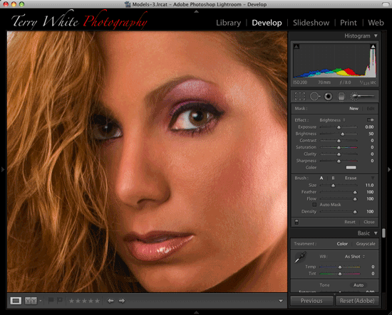

Adjustment Brush
The controls available for the local correction brush are segmented into three basic areas: Mask, Effect and Brush.  A quick walkthrough of the correction technique is below:

  • On entering the local correction panel the brush will become active.  
  • The type of desired correction should be selected from the Effect section.  A photographer can paint in a positive brightness effect for the shadows and a negative exposure effect for a bright sky.
  • Combinations of effects can be selected and saved as presets by showing the effects sliders. (Horizontal toggle in the upper right area of the effect panel)
  • The brush size, feather and opacity can be set before applying the correction.  An Auto Mask option is available to help confine the brush strokes and subsequent mask within an area of similar color.  The airbrush option provides a diffused correction application relative to the standard painting mode.  
  • Once a brush stroke is applied, a circular point or pin will appear on the image where you first applied the brush stroke.  Additional brush strokes can be applied that will add to the current correction area. To refine the area hold down the Alt or Option key to begin erasing with the brush.
  • To adjust the amount applied to the entire area click down on the circular marker or pin and move the cursor to the left or the right to decrease or increase the amount setting.
  • To refine the correction settings, click on the pin and detailed adjustments are available in the right panel and will be applied to the selected pin.  
  • Create a new correction mask or brush stroke by selecting the New option.
  • The pins can be hidden or shown with the H shortcut key.
  • Use one of the tint presets provided to apply a color tint or use the Lightroom color selection dialog by double-clicking on the rectangle to the right of the presets.  Change a preset by selecting a color in the dialog then click-and-hold on the preset box to be populated by that selection.
  • There are two brush presets represented by A and B in the brush section.  After modification of the brush controls, a preset can be updated by clicking and holding on the specific preset letter to be associated with the settings.

Graduated Filter
Recreating the effect of a graduated neutral density filter, this tool goes even further allowing the ability to modify all of the effect parameters in a single graduated effect.  Select the effect and click and drag the gradient onto the image.  Rotate and adjust as necessary. You can also return to the specific effect settings and modify them after the filter is applied.
 

Shortcut Keys
Local Adjustment Keyboard Shortcuts

  • Toggle Adjustment Brush – K
  • Toggle Graduated Filter – M
  • Graduated Filter Scale from Center – Alt/Option + Drag
  • Hide/Show Pins – H
  • Always Show – Shift + Command/Control + H
  • Show Selected/Never Show – Shift + H
  • New Adjustment Pin – Enter/Return
  • Switch Brush – /
  • Increase Amount – Right Arrow
  • Decrease Amount – Left Arrow
  • Erase – Alt/Option
  • Increase Brush Size – ]
  • Decrease Brush Size – [
  •  Increase Feather – Shift ]
  • Decrease Feather – Shift [
  • Set Flow Amount – Number Keys
  • Auto-Mask – A
  • Show/Hide Mask Overlay – O
  • Cycle Mask Overlay Colors – Shift + O
  • Constrain brush stroke to straight line – Shift
  • Invert Gradient – ‘


Vignette
: The previous lens correction vignette effect was only applied to the entire image frame and as an artistic effect could be obscured after an image was cropped.  An additional framing vignette effect has been added that will apply a vignette to an image, respecting the cropped borders.
 
Basic Panel Keyboard Shortcuts:  Photographers who prefer to utilize their keyboards for basic image adjustments will find that the +/- keys are linked to the Exposure adjustment in the Develop module.  Adding the Shift key will boost the increment amount, the comma and period keys will cycle through the basic panel controls and the semi-colon will reset the control currently in focus.

Improved Auto Adjustment:  
The Auto adjustment has been modified in response to feedback that previous adjustments were too bright.
 
Improved profiles for Raw data:  An enhanced set of profiles has been released on Adobe Labs in order to provide an improved default rendering of raw data.  In addition to the improved Adobe default profile, there are additional profiles for each camera that emulate the results that would be obtained were those settings chosen in the camera manufacturers software or if the photographer chose to shoot JPEG.
 
Print Module
Picture Package: The print module now provides the ability to create multi i-page layouts for a single image arranged in multiple sizes. This allows photographers to quickly and easily print a package of images quickly and easily.  

  • Choose Picture Package from the Layout Engine in the top right corner of the print module and a blank page will be presented.
  • In the Cells panel click on one of the preset size to add an image cell to the page or use the drop down option to edit and create your own custom size.  Cells can be added to the page until the page is filled and a new page will be added to the layout automatically.  Up to six pages can be included in a layout.  
  • After all of the required cells have been added, choose Auto Layout to automatically create an efficient, easy to cut print layout or manually move the cells to your liking.
  • To move a cell, click on the image and move the cell to the desired location.  To delete an image cell, click on the image and choose delete.  A page can be deleted by mousing over the page and clicking on the ‘X’ in the red circle.
  • When an image aspect ration is much different than the cell aspect ratio, the image can be moved within the cell by holding the CMD/CTRL key down and clicking on the image and dragging it.

Print to JPEG:  Many photographers have asked for the ability to send their Lightroom print layouts directly to a lab that will print JPEG files.  Choose JPEG as the option in the Print Job dialog to specify your print output as a JPEG file for lab delivery. (Select a custom ICC profile for your lab in the color management area)
Print Sharpening:  Lightroom previously provided three levels of print sharpening.  Impressive new algorithms have been added to automatically determine the correct amount of print sharpening required based on the output media and resolution of the file.
 
Lightroom 2 SDK
The Lightroom SDK allows you to customize and extend certain Lightroom features by creating plug-ins. In the current release these features are extensible:
 
Export functionality: You can create an export plug-in, which customizes the behavior of Lightroom’s
Export dialog and export processing. You can add or remove items from the Export dialog, alter or augment the rendering process, and send images to locations other than files on the local computer.
 
Metadata: You can define customized public or private metadata fields for Lightroom. Public or
private metadata can be associated with individual photos.
 
Web engine functionality: You can create an HTML web-engine plug-in, which defines a new type of
HTML photo gallery. The engines you define appear in the Gallery panel at the upper right of the Web
module.
 
A Lightroom plug-in consists of Lua-language files (scripts) that define the plug-in functionality, and an information or manifest file that describes the contents of the plug-in. The information file must have a specific name, and be placed in a folder with the Lua source files and resource files; the folders may need to be in specific locations.
 
Lightroom 2 beta vs. Lightroom 2
Changes from LR2 beta to LR2 below:

  • Hierarchical Dates and locations in the Library Filter. (Including days of the week for the date)
  • The Volume Browser in the folder panel. (Volume name plus several ” The volume indicators clearly indicate the hard drive that you’re working with and provide the option to show the online/offline status, the amount of space available, the number of photos you’re working with and there’s an indicator light that migrates from green to red as your hard drive fills up.  Now it’s visually much easier to move your images from hard drive to hard drive and understand where your images are stored when a external hard drive is no longer connected.”)
  •  Improved iconography for folders, collections, collection sets and output collections
  • Dedicated keyword input field in the keywording pane. (Always awkward to enter keywords when there are already a number in the field already)
  • Ability to add or remove metadata filter columns
  • Improved Keyword List interface. (Including filter by keyword to manage and organize keywords)
  • Repositioned and refined dual monitor support location and experience. (Moved from right to left and the ultimate dual monitor experience is much more polished in terms of performance and stability
  • Ability to set target collection for quick collection shortcut(b). (Target any collection as the target when you hit the B key)
  • Lightroom Web, Metadata and Export SDK available on the Adobe Dev Center
  • Local control improvements
  • Complete list of local controls including, Exposure, Brightness, Contrast, Saturation, Sharpness, Clarity and a color toning option available for the brush or gradient adjustment tool
  • Additional gradient adjustment tool
  • Improved auto-mask functionality
  • Improved brush performance
  • Additional post crop vignette options: roundness, feather
  • DNG Profiles Concept
  • DNG Profile Editor available on Labs
  • Profiles for our current raw support list available
  • Match camera JPEG looks in the Calibration tab by selection Camera Standard profile
  • Export to JPEG functionality in the Slideshow Module. (Intermediate format for additional authoring tools)
  • Enhanced output sharpening based on feedback
  • 64-bit memory handling improvements


A New Camera RAW for Photoshop CS3 and Elements 6

Camera Raw 4.5
Camera Raw has been updated to 4.5 at the same time to work with the new adjustments in Lightroom 2.  It will provide exactly the same rendering obtained in Lightroom 2.
CR/DNG Macintosh/Windows


Pricing

  • Price: Lightroom 2 is priced at $299 with a $99 upgrade for 1.x users.
  • 30 Day Trial Available
  • Cross-Platform Mac/Win

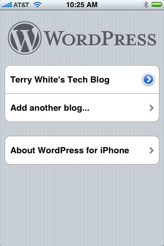
My first blog post from my iPhone

I thought I would give the WordPress iPhone app a spin. It’s pretty cool so far and will enable me to blog on the go. I love the option to post photos from the built in iPhone camera or from one that’s in your library. Unfortunately it doesn’t allow you to position them where you’d like within your post.

I also don’t see a way to do hyperlinks.

It’s not perfect, but it gets the job done and it’s FREE!

The first shot was taken with my D300 and sent to the iPhone via email and then saved to the library. The shot was from the iPhone’s built-in camera and the last two were taken as iPhone screen shots of the WordPress app.

Click the images to see full size…

photo

photo

photo

photo

GarageSale makes Selling on eBay Fun!

As a gadget guy there always seems to be a pile of stuff that I look at and say, "I need to sell that stuff on eBay." However, if you’ve ever listed something on eBay you know how tedious the process can be. I feel that my auctions bring in top dollar and the best response because of the time I put into creating the listing. I try to take several good pictures. I try to be very thorough with the description and up until now I’ve taken the time to use Adobe GoLive to generate the HTML to spruce it up a bit. I also try to always include all the original items such as the box and user guides. So sometimes (read: most times) it’s just a chore getting everything ready to go.

I came across GarageSale after talking with some friends in my Mac Users Group. After I downloaded the trial and saw what it could do, I bought it on the spot. I almost forgot I had it. Last night I wanted to put one of my old iPhones up for sale on eBay and I decided that it was time to take GarageSale for a spin.


How does it work?

GarageSale is template driven. You have a wide range of templates to pick from. The templates are already HTML formatted and you can preview your listing in them. GarageSale is an approved eBay app. So it takes complete advantage of all the eBay listing features. What makes this app so easy and fun is that it’s "Mac like" (sorry, there isn’t a PC version). It integrates beautifully with the iLife apps with a built-in Media Browser as well as support for drag and drop.

I took pictures of my iPhone with my Nikon D300 in RAW. I processed them using Adobe Photoshop Lightroom and exported JPEGs to a folder. Then I was able to just drag them from the folder right into my GarageSale page using the built-in drop zones.

Using GarageSale I was able to specify:

  • a 99¢ starting price
  • a 3 day auction
  • a starting day and time (if I chose to) or use the built-in scheduler
  • the category for my listing
  • my shipping and payment options
  • a counter on my page
  • extras such as gallery picture, bold listing etc.

Once I was done with specifying what I wanted, I just hit the Start Auction button and my images were FTP’d to my server (an option) and my listing was posted right on eBay. GarageSale also tracks your items right in the same app. So no need to constantly go to the website.

The Bottom Line

If you’re a Mac user that regularly sales on eBay, you can’t go wrong with GarageSale. After using it last night I feel that it was definitely worth the $34.99 ($59.99 Family License) admission price. Maybe now I can get to that pile I’ve been meaning to get to.

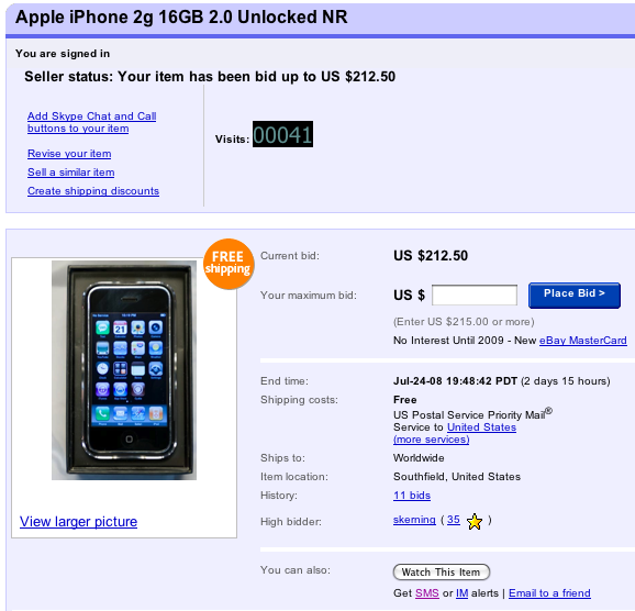
Hey, if you’re looking to buy my iPhone 16GB, you better hurry. The beauty of this GarageSale generated auction has already gotten a lot of attention and bidders on eBay. Check out the auction here.

iPhone 3g review

See my NEW iPhone 3G S Review – June 2009 Here. Last year I wrote one of the most detailed unbiased iPhone reviews on the net. It has drawn over 97,000 reads to date! So I thought it only appropriate to follow it up this year with a review of the NEW iPhone 3g. When I wrote my review last year I was comparing the iPhone to all other devices I had used including the Palm Treo 650 and Motorola Razer. This year, I'll be comparing the iPhone 3g to the original iPhone. 


My buying experience

Last year's iPhone launch was VERY organized. This was the biggest hardware launch in Apple's history and quite frankly, they nailed it! I thought to myself "this should be the model for releasing new hardware to the masses." You could tell that months of planning had gone into it. Granted it wasn't without problems, but for the most part things went very smoothly. Last year, you stood in line, got to the counter/checkout person and said either 4GB or 8GB iPhone. You gave them your credit card and they gave your iPhone and emailed you your receipt. The whole process took 5 minutes for me once I got to the front of the line. Then you went home or back to the office and activated your iPhone using iTunes. Yes there were some issues on day one (and throughout the weekend) with the activation servers being overloaded and some people having to wait longer to get their iPhones activated. Overall though, the launch was a huge success. This year things didn't go so smoothly. There were MAJOR issues on day one. Apple chose Friday, July 11th not only to release the new iPhone 3g, but also to release the 2.0 software update for the 6 million iPhone users out there and to roll out the newly revamped MobileMe online service. Some would call this ambitious! Some might call this stupid. Hind sight is always 20-20 and I guess Apple severely under estimated the demand that these simultaneous launches would have on their servers. The problem was that not only did Apple/AT&T require you to activate your iPhone on the spot at the time of purchase, but they also require people updating their original iPhones to be reactivated at the very end of the 2.0 software update process. This was quite frankly too much for the servers to handle and they crashed/timed out early in the day. Even though Apple was quoted as saying that the average activating would only take 10-15 minutes before the iPhone went on sale, it just doesn't work that way. Apple/AT&T even handed out iReady rate sheets to people in line so that they would be prepared to walk up and ask for what they wanted. However, people are going to have questions. Each question is going to delay the purchase process and make the people waiting behind them wait even longer. I would guess that the average activation was taking more like 20-35 minutes. You might ask, "why would Apple go away from just selling the device and letting you activate it on your own time?" The problem with the last launch/iPhone was that there were thousands of iPhones that were never activated on AT&T. These phones most likely ended up in other countries on other networks. Therefore, both companies lost money. So to prevent that from happening, you have to signup for your 2 year commitment before you leave the store. It's clear that this was not a limit of the technology. When the activation servers crashed, reports say that some Apple Stores just sold the iPhones and told people to activate them when they got home. I would have much rather seen Apple offer an "optional" pay, let's say $599 up front and the difference in price would be credited back to your credit card immediately upon activation. This would have made things go much quicker for those that didn't want to activate there's on the spot. Friday, July 11th 2008, 6:00 AM PST I was in Los Angeles on Friday the 11th getting ready to deliver my InDesign Seminar to a FANTASTIC audience of over 600 people. My seminar started at 10AM and I had to be there to get setup no later than 9:40AM. So my plan was to head over to the local AT&T store by 7AM. The doors were to open at 8AM and I figured I'd be out by 9AM. Before I headed over, I was talking with my buddy Scott and he told me that the iPhone 2.0 software update had just come online. So I hung up the phone with him and decided "well I can install the update while I'm showering and getting ready." That was a mistake! While the update downloaded in a about 15 minutes and installed in about another 20 minutes, I was STUCK at the "Accessing iTunes Store" stage. The last part of the process which talks to the iTunes activation server could not complete. I was running out of time. So I disconnected the iPhone which did no harm, but I was basically holding an iBrick. Without completing that last step, the iPhone could only be used to make emergency 911 calls. I had to leave if I was going to get to the store!

I made it to the AT&T store a few minutes later than I had hoped. I was 112th in line. One of the AT&T reps walked the line and counted and assured everyone up to about the 125th person that they would get an iPhone. After that person, you were not guaranteed to get one because they were not going to have enough. 8AM came and the doors opened. The line moved a bit. 8:15 came and went. 8:25 came and went. The line didn't move again until about 8:30. This was not looking good. I had my MacBook Pro with me in line (still trying to connect to the iTunes activation server to reactivate my phone). When 9:00 came, I knew that I might as well leave. There was no way that the line was going to move fast enough for me to get in and out before my seminar. So now I had no iPhone. My old one was still bricked (un-activated) and I couldn't get the new one. I finally got connected to the iTunes activation server during my lunch break and got my original iPhone back up and running again. After my seminar was over at 5PM. I called the Apple Store (knowing that AT&T was now out of stock) and I was quoted a 4 hour wait!!! I decided that it wasn't worth it. So I went to dinner and then on to the airport to catch the redeye home. After about 2 hours sleep, I made it over to my local Apple Store (Somerset Troy, Michigan) at 9AM. There were about 30 people ahead of me. I walked out with a 16GB black iPhone 3g at about 10:50 AM on Saturday morning. When I left the store, the line had grown to about 100 people. On to the review…


Let's start with the new hardware

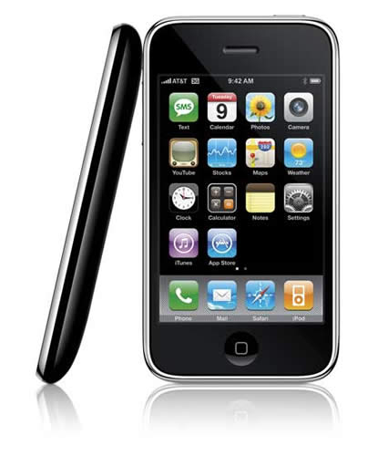
The iPhone 3g looks very similar (read almost identical) to the original iPhone, especially when you're looking at them from the front. However, when you look at the from the sides or the back you'll see that Apple has added a few more curves. The side volume control buttons and ringer on/off switch are more sleek and the stainless steel back plate is now a shiny black (or white) plastic. Although it's technically no thinner, it feels thinner in my hand. The slick black plastic also feels easier to hold. This is one of those things that's hard to convey in text. You'll have to hold one in your hands to get what I'm talking about here. By going away from stainless steel on the back and going to plastic, reception should be improved. My calls do seem to be very crystal clear. I'm also happy that the iPhone 3g fits nicely into my favorite iPhone case, the DLO Hipcase.

3g data and GPS The iPhone 3g includes not only a 3g data transceiver but also a GPS unit built-in. Although I loved surfing the web on the original iPhone, I would always hesitate to do so when I wasn't connected to Wi-Fi. The previous model relied on EDGE and while EDGE speeds were OK, it wasn't something that you would look forward to using for hours on end. The big new thing about the new iPhone 3g is that it can use AT&T's (and other carriers around the world) faster 3g (3rd generation) faster data network. Apple bills the iPhone as twice as fast and I would have to agree. In some respects they may even be being a little modest. The iPhone 3g is definitely much much much faster at loading complex websites. It loads text based websites almost instantaneously.


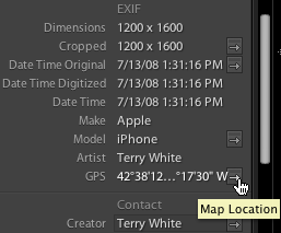
Although Apple includes a GPS with the iPhone 3g there is no turn-by-turn navigation feature. I've heard several theories on this including one that suggests with the case design, and power to the GPS, it's just not strong enough to do this. However, the GPS is strong enough to show and track your location on the Google Maps app. I tested this by plotting a route from my house to a local video game store. Once I got in my car and tapped the Locate Me button, the iPhone 3g showed my location with a pulsing icon. As I drove the route the iPhone 3g was VERY accurate in showing me where I was. It does work, but turn-by-turn with voice prompts would have been much better. Perhaps whatever the limitations are can either be overcome by a 3rd party developer or by Apple in a future software update. Smaller lesser phones have this, so how hard can it be? Geotagging your pictures! Another benefit of the GPS and Location Services of the iPhone 3g/iPhone 2.0 update is that when you take a picture with the built-in camera, the GPS data (longitude and latitude) are now stored in the metadata of the shot.


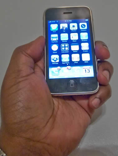
Here's a shot I took with the iPhone's built-in camera. The iPhone automatically put my location information in the file. If you click the photo it will take you to Google maps and show you where I was standing 🙂


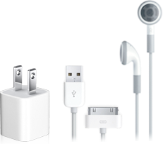
If you import these shots into apps like Adobe Photoshop Lightroom, you'll be one click away from seeing exactly where you were when you took the shot. Headphone jack and dock connector Apple did away with the funky recessed headphone jack from the original iPhone. Thank God! It was a pain in the butt to have to not only buy an adapter to use your favorite headphones, but also remembering to carry it with you. Now just about any set of standard headphones should work for listening to your iPod content. Although the iPhone 3g uses the same dock connector as all previous models and other iPods, I'm hearing reports that you can no longer use the old Firewire based chargers. There may also be issues plugging your iPhone 3g into the various iPod speaker systems out there. Typically Apple now provides a dock connector adapter with each new iPod they introduce. However, I haven't seen one yet for the iPhone 3g. Backwards compatibility The one bad thing about the slightly more curvy back is that the iPhone 3g doesn't fit properly in the original iPhone dock. Nor does the iPhone 3g come with a dock. If you want a dock for your iPhone 3g you'll have to buy it as a $29.95 add on. That doesn't bother me as much as the fact that I have the Apple Bluetooth Headset which comes with a dock that charges both the iPhone AND the headset. With the iPhone 3g I can't use that dock and Apple hasn't announced or shipped a replacement for it. So I either have to use just the iPhone Bluetooth Charging Cable which does work (charges both the iPhone 3g and the Bluetooth headset) or charge the iPhone and Bluetooth headset separately. Although Apple no longer includes a dock, strangely enough they do include a SIM eject tool so that you won't have to sacrifice one of your small paper clips. Granted I've swapped SIM cards on occasion here and there with my previous iPhones, but I can't imagine the average user doing this often. So I'm not quite sure why Apple included this tool. Perhaps it's for troubleshooting.


The other new item in the package is the newly redesigned USB charging adapter. It's much smaller! As a frequent traveler I do appreciate SMALLER electronics. However, the one thing I liked better about the older larger model is that the prongs folded down when not in use and for travel. On the new one the prongs are extended all the time. Phone Reception After all at the end of the day the iPhone is a phone! Therefore, nothing else really matters if you can't make or receive calls. I'm happy to report that the phone reception is BETTER! I would even say MUCH BETTER. There is a AT&T dead spot near my home. If I drove through that intersection while talking on my previous iPhone (hands-free of course), I would drop the call 100% of the time guaranteed. So the ultimate test was driving through that area today. Not only did I not drop the call, but the sound quality of the call remained consistent. As a matter of fact there are 3 dead spots on the way to my studio. I held a conversation today all the way from my house to the studio without a single drop. So therefore I'd have to say that the iPhone 3g definitely has better phone reception. Also I have to note that the speaker/speaker phone is definitely louder. Today I found myself needing to turn it down because it was too loud! Bluetooth Hands-free My car has Bluetooth hands-free built-in and it's compatible with the iPhone. The iPhone's Contact list downloads directly to the dashboard and I can look up numbers, make and receive calls without touching the iPhone itself. I noticed two differences with the iPhone 3g/2.0 update. The first is that now my contacts are listed last name first on the car's display. Before the update they were listed first name then last name. So if I were looking up Joe Smith, I'd go to the J's. Now I have to remember to go to the S's. No big deal, but I did notice it immediately. Also I now notice a slight echo when I'm on a hands-free call. It's not bad, but it is noticeable. I don't think the caller can hear it, but I sure can. Other than that, pairing and voice quality remained unchanged. It just works. Battery Life? It's hard to judge battery life at this point because I haven't had a "normal" day of usage yet. Like any other new toy I've spent most of the time playing with it, testing and reconfiguring settings, etc. So of course I've drained the battery faster than usual because the screen is on the whole time I'm playing. If you pinned me down. I'd have to say that battery life is less than what I had before, but again that's not fair as I haven't really used it the way I normally would yet. So let's just say the jury is still out on this one. 


The NEW 2.0 Software

Granted the addition of 3g data speeds, a GPS and a standard headphone jack are all welcomed additions to the iPhone 3g, however the big news is the updated OS. iPhone Software 2.0 comes on the iPhone 3g and is available as a FREE update to the original iPhones. It's also available as a $9.95 upgrade for iPod touch users. With the iPhone 2.0 update Apple fixed some long standing issues. One of the issues I had was an intermittent syncing problem. That issue seemed to be resolved. They also not only tweaked some of the existing apps, but made it possible to add native 3rd party apps. Search your Contacts (it's almost there) I have over 1,000 contacts on my iPhone and it was a pain in the butt either having to scroll up and down the long list or break them down into groups. Now Apple has included a search feature right at the top of the Contact window. I was very happy to see this addition. It works, but it's not quite there yet. In Address Book (Apple's contact manager) on the desktop, Apple got search right! You type in what you want and no matter where it is in the contact record, it finds it. However, that's not quite the case in the iPhone search. For example, let's say you have a contact that is listed as a business, "BMW Dealer", but you also have the sales rep's name in the name field "Jim Edmondson". If you do a search for BMW, it comes up. However, if you search for Jim – it doesn't! Searching for either BMW or Jim in Mac OS X's Address Book would find the contact. New and Improved Calculator The original iPhone calculator was basic, but had a big flaw. There was no "Clear Entry" key. So literally there was no room for error. If you were keying in a bunch of entries and made a mistake, hitting "C" would clear the whole thing. Now in iPhone 2.0 hitting "C" performs a Clear Entry (of the last entry) and you can correct your mistake! YAY! FINALLY!. If you need a Scientific Calculator just rotate your iPhone and your basic calculator turns into a Scientific Calculator. Neat! New Contacts App Apple has provided an additional way to get to your Contacts. It may seem like duplication of effort at first and it is. However, from what I'm told, this was one of the most requested features. The ability to get to your Contacts in one tap without having to go to the Phone app first is welcomed. I must admit that I've used it a few times already and I like having this additional way to get there. Microsoft Exchange and Cisco VPN! – Official Enterprise Support At Last!!! This is BIG! Most major corporations use Microsoft Exchange for their Email, calendar and contact serving. The original iPhone software only supported Exchange via (relatively limted) IMAP support. Most corporations weren't willing to turn on Exchange IMAP support for their users to use iPhones. iPhone 2.0 changes all that! This is largely because IMAP just doesn't offer enough in terms of features/security such as remote wipe and requiring a password on the device. Now there is Microsoft's Active Sync support built right in. My employer's IT department is the best! They were very eager to see this support in the iPhone. Not only were they one of the beta testers, but they had corporate email, calendaring and LDAP contact support up and running for iPhone 2.0 users on day one! It's a joy to be able to get work email pushed out to my iPhone seamlessly and better than I've had on any previous device. I can also access web pages on our intranet for the first time with the iPhone's built-in Cisco VPN support. This also alleviates the worry of losing my iPhone or having it stolen and someone accessing my data. Corporate IT departments can institute a password requirement and remotely wipe a missing iPhone once it's reported stolen or lost. The remote wipe is secure and writes 1's and 0's repeatedly to the iPhone. Even if they pull the SIM card or turn off the iPhone. Once the iPhone is back on the wipe will continue. There is no way to stop it. Setup was a breeze and done over the air. I had it up and running on Friday before I left LA. This will mean that the iPhone will now be open to millions of business users that couldn't have used the original iPhone (software). This is probably one of the most useful additions to the 2.0 version for me. Push Email, Calendars and Contacts for the rest of us Apple also rolled out MobileMe on Friday. MobileMe replaces Apple's aging .Mac service. The new MobileMe service is cross platform now for both Mac and Windows users. The $99/year service gives you 20GB of online storage, an email account and access to your contacts, calendar, pictures and files from any internet connected computer. What's new and more relevant to iPhone users is that this service offers "Push" email, contacts and calendars for iPhones. Similar to what a corporate Microsoft Exchange user would get. The idea is that you wouldn't have to plug in your iPhone just to sync a new calendar entry or contact update. These updates would happen in both directions over the air. Once the MobileMe servers actually came online and stabilized, my "Pushed" information worked as advertised. My buddy sent me an address and phone number change. I made the change in Address Book on the Mac and noticed the change just happened automatically on the website version of MobileMe. Then I checked my iPhone 3g and it was there as well! I added a calendar appointment on the iPhone and checked my iCal and it was there. Although MobileMe seems to work as advertised there are a couple things I'd like to see improved. The first and probably the biggest thing is that I have multiple iCals, "work", "home" etc. Then I have some that aren't important enough to have with me on my iPhone. However, with MobileMe you either have to sync ALL or NONE of your iCals. There is no way to pick which ones go out to the iPhone and which ones don't. Worse is that if you subscribe to other people's/organization's calendars there is no way to have Subscribed calendars pushed out to your iPhone via MobileMe. For example, my wife and I share each other's personal iCals. She subscribes to mine and I subscribe to hers. Now with MobileMe "push" there is no way for me to see her iCal on my iPhone. This is a serious omission and I hope this gets resolved/added in an update. Yes it's for both Mac AND Windows users! I can't stress enough that while .Mac was for Mac users only, MobileMe AND the iPhone are cross platform. That's one of the reasons why Apple changed the name from .Mac. So on the Windows side, MobileMe and the iPhone 3g/2.0 offers support for Microsoft Outlook. You'll get the same "Push" abilities with your Outlook calendar and contacts. 


A couple of undocumented features

With every new iPhone software update there are usually a couple of features that don't make it into the headlines. This iPhone 2.0 update is no different. The first one I am very thrilled about as I'm a co-author of "The iPhone Book", this one will be a tremendous help in finishing the update and that is the ability to natively take a screen shot of the iPhone screen. Simply hold down home button and press the power button to snap a picture of the screen. The picture is then added to your Camera Roll and can then be downloaded to your computer or emailed. The next one is a smaller, but welcomed addition and that is the Mail app now has a BCC (blind carbon copy) field. Also you can now switch the outgoing account that the mail is going to come from on the fly (this only works if you have multiple email accounts, of course). 


3rd Party App Support

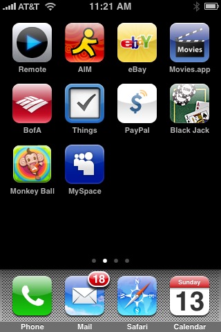
Aside from getting my work email and pushed content from my contacts and iCals, 3rd party App support is the next biggest favorite of mine. No software company can do everything. Apple is no different. Therefore, I'm very happy to see Apple open the iPhone up to 3rd party developers. There are some really great apps for the iPhone and on day one Apple announced over 500 apps that are available in the iTunes App Store! Many of the apps are either free or very low cost. Some of the new apps even addressed some of my early criticisms of the iPhone. For example, I was surprised that Apple didn't include iChat (instant messaging) on the iPhone in addition to SMS. No worries because AOL has made AIM for iPhone available as a FREE app. Also I couldn't believe that there wasn't a Movies widget that would let you see theaters, movies and show times. Now I have two. Movies.app was my favorite web based iPhone app. Now it's a native iPhone app. I also found BoxOffice. I haven't decided which one I like best yet. They're both FREE! Apple makes it pretty easy to add 3rd party apps to your iPhone. You can either download them using iTunes and then sync them to your iPhone or you can use the new App Store icon right on your iPhone to buy/download free apps. If you grab an app directly on your iPhone, it will be backed up to your your computer the next time you sync. Some of these 3rd party apps are really clever and take advantage of the built-in features of the iPhone. For example, Bank of America's "Mobile Banking" app uses the iPhone's location services. If you ask for the nearest ATM it will give you the option of keying in a zip code or simply finding it based on YOUR current location. The game Super Monkey Ball uses the built-in accelerometer and motion detectors of the iPhone to turn the entire iPhone into a game controller. Simply tilt and turn the iPhone to control the monkey through the game. Having 500 apps available on day one is just the beginning! I expect to see hundreds more apps in the coming months. 


My top 10 favorite iPhone apps

Remote, AIM, eBay, Movies.app, Mobile Banking, PayPal, Blackjack, Super Monkey Ball, MySpace OK and then there's PhoneSaber because it just makes me (and everyone I show it to) laugh 🙂


However, the app that I'm most anxiously awaiting is Slingbox for the iPhone! That will be a killer app. 


Still room for improvement

The iPhone 3g along with the iPhone 2.0 software update goes a long way towards improving an already great device. However, there are still dozens of things I'd like to see added! For starters, the one thing keeping the web experience from being perfect or near perfect is the lack of Flash support. Hopefully Adobe can get this on the iPhone soon. It is in the works! The iPhone still lacks some other basics such as MMS messaging (the ability to send/receive pictures/movies/sounds from phone to phone directly), voice dialing and video recording. Here is my original list of "50 Ways To Make The iPhone Better" (via software updates). The ones that Apple has added via iPhone software updates recently are colored blue and the ones that were added either via iPhone 2.0 or 3rd party software have been colored green. The ones in black are still on my wishlist:

1 – Ability to use My OWN ringtones (sounds, music, etc.) The iTunes store will NEVER have some of the sounds I want to use.

2 – Sync Notes to the computer

3 – Cut/Copy Paste system wide

4 – Email anything (besides notes, photos URLs) Contacts, maps, directions, voicemail messages as attachments, etc.

5 – MMS (Multimedia Messaging – send pictures/movies directly to another phone)

6 – Consolidated Mail inBox and an easier way to jump between accounts than going back, back, back

7 – Flash support in Safari (this is now my number ONE request).

8 – Video and Voice (Memo) Recording (3rd Party)

9 – Color coded or Separate Calendar views (just like iCal does today)

10 – Searchable Contacts (there but still needs improvement)

11 – To be able to assign ringtones to groups of Contacts (it's really a pain doing them one-by-one)

12 – Wireless Syncing iPhone to Computer over Bluetooth or Wi-Fi (MobileMe Push)

13 – Voice dialing (3rd Party app – Speechcloud Voice Dialing – I haven't tried this app yet)

14 – Dial-up Networking (use the iPhone as a modem)

15 – iPhones on AT&T corporate plans (discounts or not, I shouldn't have to setup a personal account to use the iPhone on AT&T)

16 – Landscape Keyboard entry in all the apps

17 – Additional Audio email attachment support for files in Vonage (u-LAW encoded) WAV format

18 – Email to a group of Contacts

19 – iChat/AIM built-in (3rd Party)

20 – Calculator CE (clear entry) key

21 – Native Microsoft Exchange support (MS Direct Push or 3rd party support).

22 – Wireless stereo music playback over Bluetooth and AirTunes

23 – A one button Redial feature (example: triple tap the Home button)

24 – A "Dialed" list in addition to "Recent" and "Missed Calls"

25 – Ability to play music directly from the Slideshow feature

26 – Built in Unit Converter (I expect a 3rd party app for this)

27 – To Do's, sync'd with iCal/Outlook

28 – Password/Pin protected Notes

29 – An option that lets me choose what screen I land on when I wake my iPhone; it can either be (a) whichever I screen I was at last, like it does now, or (b) I can choose to always start at another screen (like the phone favorites, or the Home, etc.).

30 – Being able to rotate Mail 90 degrees

31 – Keynote app (now with TV out, you could use your iPhone for slide presentations without needing your laptop)

32 – Pseudo GPS based on cell towers to tie in with Google Maps feature (iPhone 3g includes a real GPS too)

33 – General file storage like a USB drive (Enable iPhone as a Hard Drive)

34 – Support for Stereo Audio over Bluetooth headphones

35 – Support for a Bluetooth Wireless Remote AND the ability to use the iPhone as a Remote

36 – Sound Profiles (example: I would create a profile that turns off all sounds except incoming calls for traveling)

37 – Auto dialing of a string of numbers/pauses (ie. you dial your company voicemail and tap a button to dial your ext. and pin)

38 – Built in "Movies" widget (show times, buy tickets, trailers) Yes I know there are good web based ones. Having one built-in would be faster to access and could remember your settings. (3rd Party)

39 – Safari password remember/store feature (Keychain for the iPhone)

40 – Multiple email signatures (also the ability to assign default ones per account)

41 – Mail spam filtering

42 – Mail Rules

43 – Full Bluetooth support on the Mac (Browse the device, dial from Address Book, etc.)

44 – Delete multiple items at once such as emails

45 – iPod songs as Alarm sounds

46 – A true RSS reader (the one in Safari desktop would be a good start) (3rd Party)

47 – Call duration display

48 – SMS to multiple Contacts

49 – .Mac Push Email

50 – The ability to direct ALL of the Audio sources over Bluetooth (such as email attachments, audio on web pages)

51 – Built in Dictionary/Thesaurus (3rd Party)

52 – Add a ".com" button on the MAIL keyboard as well.

53 – view PowerPoint attachments and now iWork files too. Â So as you can see Apple has made progress towards my list 🙂 


The Bottom Line

I still feel the same way I did a year ago. The iPhone is not perfect! However, in my opinion it is the quite simply the best smartphone out there! The iPhone 2.0 software update brings 99% of what's on the new iPhone 3g to ALL iPhone users at no additional cost. Although Apple bills the iPhone as "Twice the speed, half the price", the iPhone 3g will end up costing you more than the model it replaces. This is due in part to the fact that AT&T raised the charge for unlimited data from $20/month to $30/month. They also no longer include the 200 SMS text messages like they did before. To get the same 200 messages as before it will cost you $5/month more now. When Apple says "Half the price", they are really referring to the cost of entry. The iPhone 3g now starts at $199 for the 8GB. That's a far cry from the original price of $599 (then dropped to $399). Also since this is a subsidized phone, in order to get the $199 or $299 price for the 16GB model, you have to either be NEW to AT&T or eligible for an upgrade. I watched a guy storm out of the Apple store because he hadn't had his existing AT&T (non-iPhone) phone for 18 months and therefore didn't qualify for the upgrade pricing. The iPhone 3g is available in a black 8GB model or your choice of black or white in the 16GB model. The iPhone is available here in the US by either visiting your local Apple store or AT&T store. To see many of the new iPhone features in action, check out Apple's iPhone 3g Guided Tour.


iPhone 3g News Since My Review: iPhone 2.0.1 Software Update Speeds Up The iPhone


See my NEW site for App Reviews and News – bestappsite.com

BestAppSite-banner2

Apple releases Mac OS X 10.5.4 and it helps CS3

Yesterday Apple released an update to Leopard (Mac OS X 10.5). This is probably one of the most important updates to Leopard since the day it shipped because it fixes some long standing issues with Adobe Creative Suite 3. One of the apps that suffered the most under Leopard was Adobe InDesign CS3 with frequent random crashes. Thankfully this update (10.5.4) fixes this problem! This is a MUST HAVE Update to all Leopard and CS3 users!

Adobe has also responded with an update of its own to InDesign CS3 (5.0.3) that fixes other issues as well.

Don’t walk, but run to go do both of these updates!

Shooting tethered: Mac or PC which is fastest?

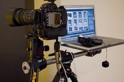
I had been hearing a nasty rumor from my colleagues and photographer buddies that shooting tethered on a PC running Windows was faster than shooting tethered on a Mac. This was due largely in part to the native USB 2.0 drivers for each operating system. I shoot tethered into Adobe Photoshop Lightroom 99% of the time when I’m in the studio. Having to wait 6-8 seconds for the image to pop up on the display doesn’t sound like a long time until you’re sitting there waiting. The advantage of shooting tethered is that you can see your results on a nice large display and make adjustments along the way.


So I put it to the test

Sorry guys I don’t have a tech lab with guys walking around in lab coats. It’s just me with a stop watch on my iPhone. So if you feel that I’m wrong, that’s ok. Just do your own tests then. My testing setup was simple: I have a MacBook Pro running the latest version of Mac OS X and Windows XP SP2 via Boot Camp. I shoot with a Nikon D300. I use Nikon’s Camera Control Pro 2 to automate the process of bringing the image in from the camera to a folder. Since Camera Control Pro 2 ships with both the Mac and the Windows version on the same disc, I didn’t have to buy anything else. Once the image is in the folder I have Lightroom (LR) setup to Auto Import and display the image in loupe view which means it has to build a preview on the fly as well. I didn’t have any other apps running in either environment. I did each test after a cold boot. I also ran multiple captures to make sure the timing was consistent. I shoot 99.9% of the time in RAW so I didn’t bother testing JPEG shooting. I’m sure the times would be much faster since JPEG files are much smaller. Since I don’t plan on switching to shooting in JPEG, the faster times would be irrelevant to me.


Here are my results, which surprised me!

First I just wanted to see which OS would import the Nikon D300’s 12 megapixel RAW (.NEF) images fastest? So I just ran Camera Control Pro 2 (CCP2) with nothing else open and fired off some exposures. The PC blew away the Mac! This wasn’t looking good at this point. The PC dumped the image into the folder in 3.2 seconds from pressing the shutter, while the Mac took 7.2 seconds. At this point I was starting to think that I’ll be shooting tethered in Windows under Boot Camp from now on. However, it dawned upon me that this is only half the story. The other half of the story is after the image is in the folder, how long it takes the image to get into LR and show on screen. So I continued my test by launching Lightroom 1.4.1 and setting up the auto import. I then ran tests of the complete process from the time I press the shutter until the image is on the screen in loupe view. The results surprised me! When it was all said and done, the PC was faster, but only by .7 seconds! It seems that either LR is either really efficient with Auto Import and building previews on the Mac or sucks really bad at it on the PC (glass half full or empty depending upon how you look at it).

  Windows Mac
CCP2 import 3.2 seconds 7.2 seconds
LR import (complete process) 8.2 seconds 8.9 seconds


The Bottom Line

If all you need to do is shoot tethered and get the images into a folder, then it would seem that Windows would be the way to go. However, if you shoot tethered into LR, then there isn’t enough of a speed advantage to switch from the Mac OS! Canon shooters, you mileage may vary as well. Since Canon provides an app to automatically bring the images from the camera into a folder, you may see different results depending upon how their software is optimized for each platform. Also if you use other apps to shoot tethered and display your images (such as the software by the camera manufacturer), your mileage my vary. I ran the only tests that mattered to my workflow which is Nikon D300 to CCP2 to LR.


Need more room?

I like to keep at least 20-30 GBs free on my MacBook Pro hard drive. Lately I’ve been working with less than 10 GBs free. It really started becoming a problem over the weekend as I started getting "out of space" errors right in the middle of a photo shoot and while working in Photoshop.


I started wondering "what could be taking up so much space?"

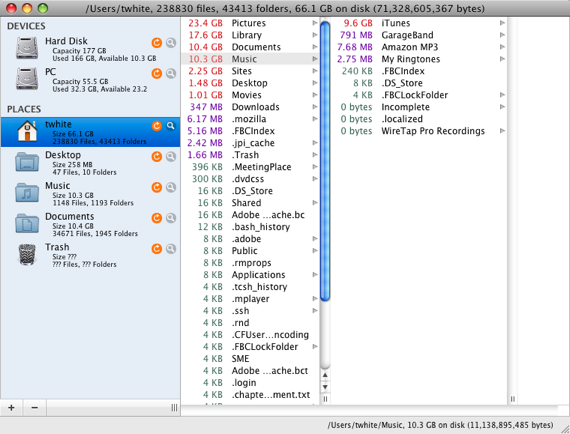
I know that the Mac OS X Finder can list the size of your items and folders and sort that way, but it’s too slow. So I downloaded the really cool shareware app – WhatSize. This was the best $12.99 I’ve spent in a while. With this little gem I was able to immediately identify about 7 GBs of files that I either no longer needed at all (like two very large podcasts) or files that didn’t need to be on my internal drive. This app is amazingly FAST! I could quickly drill down on those large numbers and see exactly "WHAT" was taking up so much space? Within about 10 minutes I had over 13 GB free and I’m still cleaning stuff off and I probably will upgrade to a larger drive soon, but for now this app rocks!

My favorite movie cataloger just got a major update

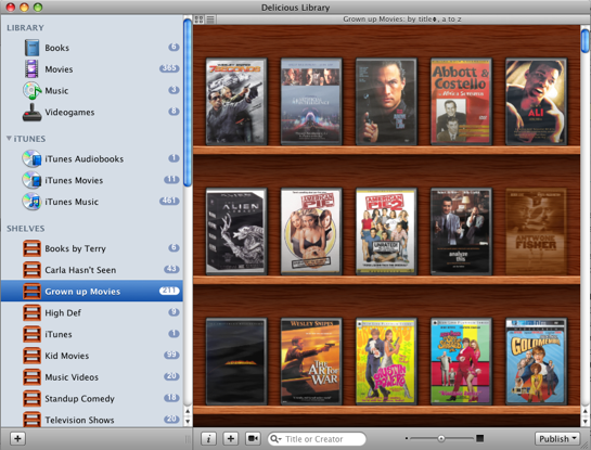
Although I don’t buy movies like I used to, I do have a 350+ DVD collection. As I get older I often times don’t know which movies I have and which ones I don’t. That’s where Delicious Library comes in. My colleagues turned me on to Delicious Library a few years ago and I’ve used it ever since to catalog my DVD collection. The one thing (as a gadget junkie) that really turned me on to it at first was the ease of entering your info about your stuff. You simply scan the barcode! Yep, that’s it! Using your iSight camera (it’s a Mac only app), you scan the barcode on the back of your book, DVD, game, etc. and it does a look up on Amazon and pulls down the title, artwork and description. I was able to catalog my entire collection in an evening. The other thing I really liked about Delicious Library is that it also keeps track of stuff you loan out. I would loan out DVDs all the time and forget about them until I went to go watch them myself. Then I would think, "who did I loan that to?" I have even been known to call around looking for something I’ve loaned out. Delicious Library integrates with Address Book and to loan something out, you simply drag the item to the contact you’re loaning it to. Then it even sets up a proposed reminder in iCal as to when the item is due back.

Although I use Delicious Library primarily for DVDs, it’s not just for movies. It can keep track of your books, video games, music CDs and just about any other media you have.


The most Mac like app outside of Apple

Delicious Library has to be one of the most Mac like apps I’ve ever used outside of Apple’s own apps. It looks and feels like an app from the iLife package. Delicious-Monster prides themselves on taking advantage of as many features as they possibly can in Mac OS X. Version 2 goes even deeper and takes advantage of Mac OS X 10.5.3’s core services to the max.


What’s new?

Delicious Library 2 (DL2) has taken things up a notch or two. The interface has been refined and sped up quite a bit (Version 1, could be a dog with a lot of items in it). This new version is much snapier. They integrated directly with iTunes now. So your iTunes items such as movies, audio books and music show up right in DL2. See an album you want to play, click on it right in DL2 and it will start playing it in iTunes. It even works with your Apple Remote.

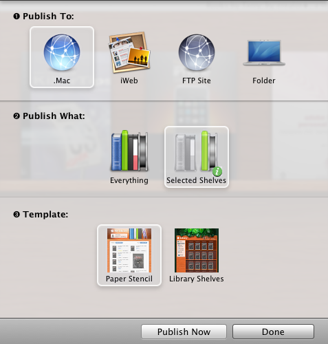
DL2 also sports a new web publishing feature that allows you to take your catalog (or specific shelves) to the web. It works directly with .Mac or iWeb and can upload directly via FTP or simply publish to a folder. The FTP upload feature didn’t work for me. I put in all my FTP info and every attempt to publish just sits at 0% complete with no progress bar or errors. So I just published to a Folder and used my favorite FTP app, Transmit to publish my DVD collection here. If you have an iPhone or iPod touch, they’ve even put in the extra code to take advantage of the mobile version of Safari on those devices. It’s pretty impressive! This way if you were out and about and were about to buy a movie or CD that you may already have, you could whip out your iPhone and check right there on the spot. Don’t have an iPhone? No worries, they also do exports and syncs to regular iPods too.

DL2 also incorporates one of the features I’ve wanted for a while and that’s Library Sharing. This allows others on your local network to use their copy of DL2 to see your Library. I keep my main Library on my iTunes iMac and now the family can see what we have from their Macs.


DL2 introduces "Smart Shelves"

I haven’t quite figured out if and how I’m going to use this feature yet. Like iTunes’s Smart Albums, Smart Shelves allow you to set up criteria such as "Actor contains "Denzel Washington" and any movies you have with Denzel in them will automatically populate the shelf. That’s just the tip of the iceberg. You could do book authors, genres, formats, etc. etc. There’s a mile long list of Smart Shelf criteria to use.

All and all, this update is well worth the $20 upgrade ($40 entry price). As soon as I get my FTP upload working, I’ll be 100% satisfied (I know, I know)! To see a complete list of features or download the trial, go to Delicious-Monster.com.

My ScreenFlow issue has been FIXED!

I have to really hand it to Brian Novak over at Vara Software (the makers of ScreenFlow). I sent them a tech support email explaining my crashes upon export and Brian quickly responded. He requested the crash logs from my system and within minutes narrowed the problem down to a conflict with my Nvidia card/drivers. Turns out that the "Show Keys Pressed" feature was the culprit. As soon as I turned that off, the export went fine!


Now I really DO like ScreenFlow!

This App is amazing at what it does and is backed by a company that wants it to work properly. I’ll be using it again when I record my next podcast episode. Although I don’t like the fact that it has to export/render the finished video (which for my 28 minute video too 30 minutes to export), the extras such as callouts and simultaneous DV camera recording are worth it.

I want to like ScreenFlow

A couple of weeks ago while attending the ADIM conference my buddy Colin Fleming turned me on to a new (well new to me) screen recording app called ScreenFlow (sorry PC users, this is Mac only). As you know, I’m always recording tutorials, podcasts, online classes, content for instructional DVDs, etc. So I depend upon my screen recording software weekly. My current choices are iShowU, which has become my primary app and SnapzPro X which not only does screen recording, but also does screen grabs in various formats with pro level controls.

The thing I absolutely love about iShowU is that once you’re done recording, that’s it! There is no post processing/rendering. The QuickTime movie pops up instantly. So it’s going to be hard to get me to go back to an app that has to render the final movie out after you record it.


Then why would I consider ScreenFlow?

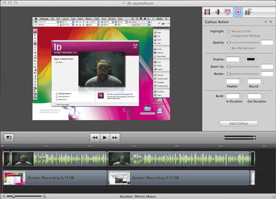
Although ScreenFlow does require post process rendering, it may be worth it because of all the editing capabilities it has. Unlike iShowU and SnapzPro, ScreenFlow allows you to do post process editing right in the app. It also has a major advantage in that it also allows you to simultaneously capture your video via your iSight camera or other camera source. While all the apps capture your audio and computer audio (if you like), only ScreenFlow captures your video too. I really like that feature. ScreenFlow also adds several other enhancements like being able to cut out mistakes! Last night I recorded my most recent Creative Suite Podcast episode and I made a mistake during the recording. Once I was done recording, I was able to scrub to the mistake on the timeline and cut it right out. Not only can you make edits, you can have multiple tracks. So you can add in graphics and other recordings after the fact. Let’s say you mention a URL during the recording, you can add that URL as a graphic the pops up in the lower portion of the screen during the time that you mentioned it.

While these features are great, the other thing that really attracted me to ScreenFlow was the fact that it allows you to put in "Callouts." Callouts allow you to do things like zoom in on your cursor during post editing. You can add a click sound so that people know when you clicked your mouse. You can even add a radar type flashing circle so that people can see your pointer on screen and know exactly where you clicked. With Callouts you can also have your keyboard shortcuts displayed automatically on screen at the point you typed them. Very cool!


Putting ScreenFlow to the test!

Like I said, I wanted to see if ScreenFlow would be worth the post process rendering (during export). So I recorded my latest Adobe Creative Suite Podcast episode using it. This episode is a little longer (ok, a lot longer) than my average ones. It was almost 30 minutes long. That’s OK, because that’s as real world as it’s going to get for me. The recording worked GREAT! Editing on the timeline worked great. I was able to do a Ripple Delete and cut out a mistake I made during the recording (something iShowU and Snapz, don’t allow). I even took the time to add in some of the Callouts. After I was done editing, I did an export and that’s where the disappointment came in. About 3-5 minutes into the export process, the app crashed! I fired it back up (luckily I had saved my work) and tried it again. It crashed again at the same spot. I tried changing my export options several times and it crashed each time. Now I was annoyed that I wouldn’t be able to get my beautifully recorded podcast episode out of this thing and worse I’d have to record it over again using iShowU. However, I was persistent. I thought to myself, "it must not like something that I’ve added to this video." So I started turning off the fancy Callouts. Eventually I must have turned off the right one, because the export finally worked! I was too tired to try and narrow it down to exactly which Callout was causing the issue. Each time you relaunch the app after a crash it offers to send the crashlog to the developer and I did. So hopefully he’ll be able to fix this little (super annoying) glitch.


All in all, it’s a great app! I’m still not a fan of rendering, but it’s the price I’ll have to pay for the features that I can now add to my recordings to produce better recordings in the end. Although I didn’t use a timer, I would say that my export took about 15 minutes to complete of my 30 minute recording on my MacPro. ScreenFlow goes for $99.99 and you can download the demo and try it for free. Also check out the ScreenFlow demo video to see what’s possible.