iPhone Software Update 2.2

On Thursday night last week, Apple released the iPhone 2.2 update. I’ve had it installed and have been playing with it over the weekend and thus far no issues. The official list of new features is as follows:


Enhancements to Maps


  • Google Street View
  • public transit and walking directions
  • display street address of dropped pins
  • share location via email


Enhancements to Mail


  • resolved isolated issues with scheduled fetching of mail
  • improved formatting of wide HTML email
  • Improved stability and performance of Safari


Podcasts are now available for download in iTunes

Decrease call-setups and call drops

Improved sound quality of visual voicemail

Pressing the Home button from any Home screen takes you to the first Home screen

Preference to turn off auto-correction in the Keyboard settings.

I’m really impressed and happy with the additions to the Maps app. Apple did a great job in implementing Google Maps Street View. Here’s how it works:

You can access Google Maps Street View (in areas where it’s available) by either using the Drop Pin feature or search for an existing Address/Contact. If Street View is available, the little orange guy/icon on the left of the address will be highlighted so that you can tap it. Once you tap it, the iPhone will go into a 360° Interactive Street View. You can use your finger to navigate around and see the area. It’s really pretty cool!


You can also get directions now using public transit and walking directions! This is really handy in places like New York City. I’ll never forget years ago following a set of directions that had me walk all the way around the block avoiding one way streets, arggghhh!


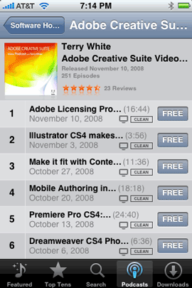
It’s also cool to be able to download podcasts now directly to your iPhone via the iTunes Wi-Fi store. One less reason to have to connect your iPhone to your computer to do a sync. So go ahead and check out an episode or two from my Adobe Creative Suite Video Podcast 🙂


Although these are cool features, the one that I’ll probably use the most is one of the smallest ones. Now when you’ve scrolled to a second, third, forth, etc. Home screen, you can tap the Home button to get back to the first Home screen without having to go back, back, back. I have 6 home screens so this will come in extremely handy. The iPhone Software Update 2.2 is now available through iTunes. Just plug your iPhone in and it should prompt you to do the download/install.

iPhone App of the Week – iChoose

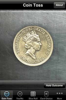
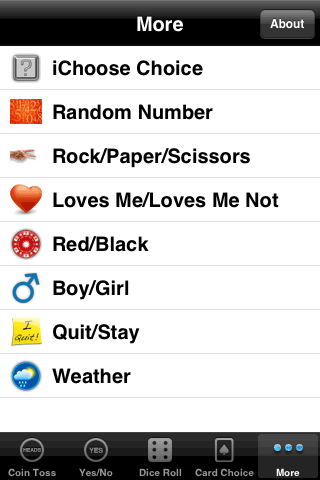
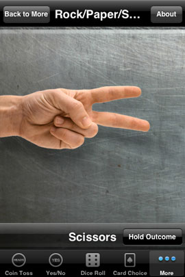
Having a problem making a decision? Thinking of flipping a coin and going with chance? If that’s how you roll, then iChoose is your app. This isn’t just your basic coin flipping app. iChoose has got it all: Coin Toss, Yes/No, Dice Roll, Card Choice, Boy/Girl, Weather, Quit/Stay (in these economic times STAY!), Loves Me/Loves Me Not, and even Rock, Paper, Scissors. The latest version even comes with a random number generator, which you can set the range for in the preferences. 

Does this app solve the problems of the world? No, but it does make being on the fence regarding a decision a lot more fun. Check it out in the App Store. It’s FREE and works on the iPhone and the iPod touch. Download it here.


Reading SDHC cards via the ExpressCard slot

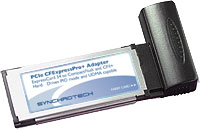
I’ve been using ExpressCard media readers for about as long as I’ve been using a MacBook Pro (years). I’ve used ones from SanDisk, Griffin Technologies, Synchrotech and now Belkin. Hands down my favorite Compact Flash reader/writer is the Synchrotech CF Express Card Reader. This is one of the only ones that takes true advantage of the ExpressCard slot’s speed when reading high-speed UDMA enabled Compact Flash cards. Read my earlier reviews of this card here and here.


What about reading SD cards?

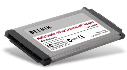
My point and shoot still camera and consumer HD camcorder both use SD cards. So what about those? Although I love my San Disk 12-in-1 memory card reader, it’s really overkill since I’m only dealing CF and SD cards these days. Also since I don’t want to read CF cards at USB speeds, then I would only be using that reader for SD cards. So my answer is a very small ExpressCard Media Reader. I actually have a couple of these. However, I recently realized that the ones I have are older models that don’t read the high capacity SD (SDHC) cards. I ran into this problem just last weekend while doing an Adobe Premiere Pro CS4 demo. I needed the read the 8GB SDHC card from my Canon HF10 HD camcorder. My old Belkin ExpressCard reader wouldn’t mount the card. Luckily there was someone in the audience with a newer model and he let me use his.

Knowing that I was going to need to use one from here on out (SD cards continue to grow in capacity), I stopped by the Apple Store while I was in San Francisco for Adobe MAX. I was looking for the same brand that he had let me borrow (SanDisk). Unfortunately, I could only find ONE model and it was the Belkin. As a matter of fact it was the last one left and it looked just like the one I was using already. However, on the side of the packaging it did specifically show the SDHC logo, so I took a chance and bought it. When I got back to my hotel room, I compared the two and there was a difference in part number. So apparently Belkin had upgraded it. It worked like a charm!

Although these ExpressCard readers from Belkin and others (not counting the Syncrotech CF reader), go in the ExpressCard slot, they operate at USB speeds. So you really don’t gain anything speed wise (until someone develops a native ExpressCard slot one for SD), however, you do gain on compactness. When this Belkin reader is in the ExpressCard slot it’s flush with the side of my MacBook Pro. So nothing sticks out. You could even leave it in all the time if you don’t use your ExpressCard slot for other cards.

These readers read/write: SD/SDHC, MMC, MMCplus, MemoryStick, MemoryStick Pro, and xD-Picture Card without the need for an adapter. There really is no functional difference between the Belkin, SanDisk and Griffin Technology (although the Griffin reader doesn’t specially call out SDHC. It may not be updated yet!) readers. However, since they they all do the same thing and both the Belkin and SanDisk readers specifically list SDHC, you’re probably better off going with the SanDisk. Why? Because it lists for only $17.29, while the Belkin reader lists for $29.99. Had the Apple Store had the SanDisk model for that price, I would have gotten it.

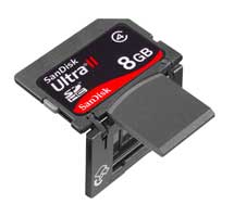
If your Mac or PC notebook has an ExpressCard slot, then having one of these adapters is a must. They will fit in just about any pocket in your laptop bag. If you need Compact Flash support and you have an ExpressCard slot, then go with the Syncrotech. It will be way faster than your USB reader. If all you’re going to use is SD/SDHC cards, then you might be better off going with SanDisk’s very clever Ultra II SD/SDHC Plus Cards. These cards fold in half to expose a USB plug that goes right into your computer. No card reader necessary. They are my FAVORITE SD cards hands down!

Cool things at Adobe MAX 2008!

I’m here at Adobe MAX in San Francisco! This is actually my first time attending MAX and I gotta say that it’s blowing me away! There are about 5,000 people here that are attending sessions from sun up to sun down. This morning’s general session/keynote Adobe announced the NEW Adobe Flash Platform and showcased several very cool solutions around Adobe Flash and AIR. Adobe also announced that Major League Baseball (MLB) was going to be streaming their games now via Flash (take that Microsoft Silverlight). 

I taught two sessions yesterday on the conference track and have more to teach today and the audiences have been great. This is THE CONFERENCE if you’re a designer or developer. There are hands-on labs, conference sessions, birds-of-a-feather gatherings in the evening and the chance to meet with the actual engineers that write Adobe products and solutions. I’m having a blast meeting so many interesting customers. Thanks to those of you who read this blog and watch my Creative Suite Podcast that came up to me and said hello.


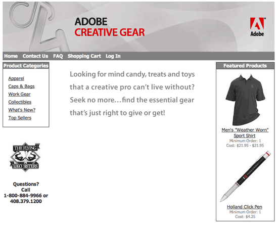
The Adobe Logo Store is back!

Now you can get your Adobe Gear on! When I did the CS3 tour last year, one of the most popular areas during the breaks, was the Adobe CS3 Logo Store. You could get hats, t-shirts, bags, pens, toys, etc. all bearing the Adobe CS3 logos. People were buying stuff left and right. Once the tour was over the store’s webpage also went away. I’m please to report that the NEW CS4 Gear Store is here! Now you stock up on your Adobe CS4 stuff, just in time for the holidays 🙂

2008 MacBook Pro Review

Fortunately my MacBook Pro is supplied to me by my employer. It’s my work computer. Therefore, I have to wait an adequate amount of time (usually around 18 months) before requesting a new one. This time around I waited a lot longer. The last two updates to the MacBook Pro were good, just not earth shattering. I didn’t feel like going through the hassle of transferring to a new MacBook Pro (including Boot Camp) the last two times. So I waited and kept using my MacBook Pro 2.33GHz model. Now I’m glad I did!


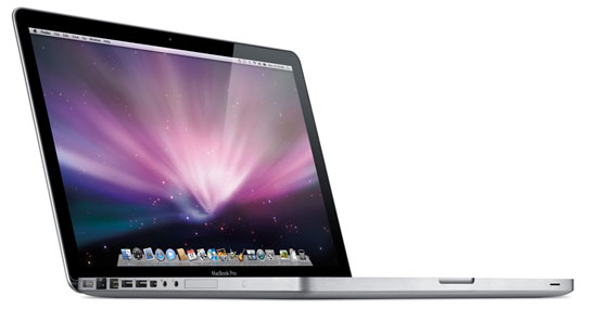
The New MacBook Pro

Apple has completely redesigned the MacBook Pro! As with anything, there will be some pluses and minuses and I certainly have my list. So let’s get to it:


The Pros:

The New MacBook Pro is crafted out of a single piece (brick) of aluminum through a new manufacturing process at Apple that looks pretty amazing. I can definitely see the benefits of this process because my New MacBook Pro is very sturdy. I can remember the days of the PowerBook G4 Titanium and how “flexible” those cases were. If you squeezed too hard while the CD drive was going, you would hear a grinding noise. Or if you flexed the casing too much the battery would fall out. Those days are gone, this thing is built very well. I also appreciate going to black keys on the keyboard. My keyboard over the years was really getting kind of grimy and this new keyboard should hide the dirt better. All the ports are back to being on one side. I kinda like this, although in some cases they are a little too close together. It can get pretty tight trying to plug in two USB cables, ethernet and Firewire 800. The speakers are much nicer and louder than any previous model. The new graphics card kicks butt! Graphics performance is night and day faster over my last model. Since CS4 takes advantage of the GPU, I’m seeing some really nice speed increases across the board. One of my long time pet peeves has finally been addressed. The two components that I have usually upgraded in the past on my MacBook Pro were the RAM and the hard drive. While I usually max out the RAM right off the bat, I may not upgrade the size of the hard drive until months later when larger capacities are available. Replacing a hard drive in PowerBooks and MacBook Pros has always been a real pain. Now Apple has made the hard drive very accessible via the same door that hides the battery. I took the cover off to take a peek and it was right there. I was speechless. The built-in iSight camera has improved drastically in image quality. Lastly I also really appreciate the speed. It is noticeably faster in many areas over my older model. If you want to continue to be in a happy place, stop reading now and go place your order. Have a nice day.


The Cons:

We have to take the bad with the good and there is some bad with this new model. While there are some Apple zealots out there that may not like to ever hear anything bad about Apple, the fact is Apple does make mistakes like any other company. The products are not perfect. Very cool, exciting yes, but not perfect. Everyone’s entitled to their opinion and here’s mine: The two areas I was most concerned about was the glossy screen and the new trackpad. The new LED glossy display is VERY BRIGHT! Almost too bright. I find myself sometimes turning it down a notch. I’ve used it now in all the places I normally use it in around the house and no real issues. Photos look fantastic on it and color looks awesome.  Apple decided to cover the display with glass! I was thinking that this was going to be a nightmare. As you might imagine, glass is highly reflective. So far this hasn’t been an issue, but I do notice the glare when looking at it from the sides. Another interesting thing was actually seeing the reflection of the backlit keyboard in the display under certain lighting conditions. As I tell people with any display/monitor, you need to see it with your own eyes, before passing judgement. No reviewer can tell you if it’s going to be right for you or not. It will also depend upon the lighting conditions you’re going to use it under. While I like the new black keys on the keyboard, the keyboard itself is missing a couple of things. I really miss the separate Enter key on the bottom right of the keyboard. I also miss the ability of having a numeric keypad using the Numlock key. I can’t figure out why Apple would remove this functionality? In the Pros section above, I mentioned that I liked having all the ports on one side. I do! However, I do miss having a USB port on the right side too. On occasion I use an AT&T USB Connect 881U USB 3G modem for internet access when I travel. Due to the width of this modem, it blocks the other USB port. This wasn’t an issue before, because I had another USB port on the other side of the computer. As I write this I have a Firewire 800 drive and an Ethernet cable plugged in and it’s really tight with no space between them. Speaking of ports, I really miss the other Firewire port. My older MacBook Pro had both a Firewire 800 and Firewire 400 port. While Firewire is daisy chainable, I have to remember to always have either the right cables with me or an adapter since I have a mix of Firewire 800 and 400 devices. If you get the new MacBook Pro, you will definitely want to get this Firewire 400 to 800 adapter. Apple also completely changed the battery. While that’s not uncommon they did a couple things to make it a little harder on travelers. I normally travel with at least one extra battery for my MacBook Pro for those cross country flights. The new MacBook Pro’s battery is longer/bigger than the previous model, which is going to be a consideration for packing my computer bag. Also Apple removed the battery charge indicator from the battery itself and put it on the side of the MacBook Pro. While this makes it more convenient to check the charge of the battery while it’s installed, it makes it impossible to know if a spare battery is charged or not without first putting it in the computer. Speaking of which is not as easy to do either. Now the battery is behind a removable door, which you must take off first!


My biggest complaint!

Yes, this con is so big that it needs it’s own section. Like I said earlier, I use my MacBook Pro about 90% of the time. So that means that I’m going to be using the trackpad a lot too. Yes, I know I know – you say get a mouse or a tablet! I have both a mouse and a tablet and I use them. I use my Bluetooth mighty mouse when I’m doing demos and I use my Wacom tablet when I’m doing photo retouching and demos as well. However, there are plenty of times where I’m just doing email, surfing the web, writing this blog post, etc. and I don’t always have a surface to put a mouse on. I could be sitting in an airport, on a plane, sitting in bed or laying back in a recliner. I’m not going to grab a mouse in these situations. Never had to before, I shouldn’t have to now! The new MacBook Pro’s trackpad is completely redesigned. The separate “click” button is GONE! The whole trackpad (actually most of the lower section) is a button. This has it’s pluses and minuses too. Unfortunately it has more minuses than pluses. It’s just sometimes awkward to click and drag objects. Speaking of clicking, this trackpad is the loudest I’ve ever heard. When you click it, everyone around you will know! This includes your sleeping mate that is lying next to you while you work late. I could deal with this if the darn thing just worked consistently. It seems that depending upon where you click (for example the center vs. the sides, you may get a click you may not. Now in all fairness, Apple is rumored to be working on a software fix to address at least this one issue. Let’s hope they can address other issues too. The New MacBook Pro has additional gestures that you can perform on the trackpad such as pinching to zoom in and out of photos. Photoshop CS4, InDesign CS4, iPhoto, etc. take advantage of these gestures. However, as it stands right now in their current implementation, it’s just too sensitive to be useful. I’m also stunned that there is no way to turn them off! This makes working in Photoshop or iPhoto very challenging from the trackpad. Sure, you can just use a mouse! Yeah, I get that. However, that’s a workaround! The trackpad is built-in and should be usable! I had none of these issues with the old one and used the old trackpad the majority of the time. Let’s hope that much of this is addressed in the upcoming software update. I want to believe that I’ll get used to the trackpad. These few days were kinda rough. It puts me in the mind of the first week I started typing on the iPhone. I thought that was going to take a long time to get used to too. However, it’s second nature now. We’ll see how this goes over time.


The bottom line

Despite the issues I’m having with the trackpad, I’m very pleased with the New MacBook Pro. The Glossy display is no where near as annoying as I thought it would be. The new MacBook Pro is solid, gorgeous and fast! Migrating over from my previous MacBook Pro was a piece of cake (I still have Boot Camp left to do). It was worth the wait and I would gladly do it again. My configuration is the Core 2 Duo 2.8GHz, 320GB 7200 RPM hard drive with 4GB of RAM. Should you upgrade to the MacBook Pro. If you want a faster better built MacBook? YES! However, you need to see the display for yourself! What is acceptable for me, may not be for you.

iPhone App of the Week – MyWeather Mobile

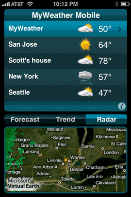
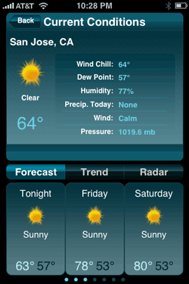
The iPhone has a built-in weather app. So why would anyone pay $9.99 for another one? I was very hesitant at first to try MyWeather Mobile. After all $9.99 is on the high end of iPhone app prices. Although the built-in weather app does a good job of letting you know the current conditions and the highs and lows, it does nothing for showing you forecasts, trends or precipitation. 


Is it going to rain/snow today?

If you live somewhere that has mild climates or weather that doesn’t change much, then you can probably be quite content with the built-in app. However, if you live in the North or Midwest, then you know weather can change at the drop of a hat. Here in Michigan it could be 70° and sunny, raining and cloudy, snowing with sleet and hail all in the same day. As a frequent traveler, I want to know what I’m heading into. Will there be a chance that my flights could be delayed or cancelled due to weather?


MyWeather Mobile

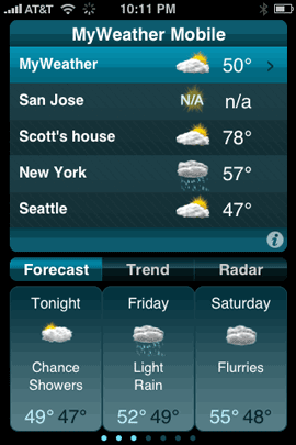
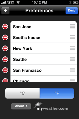
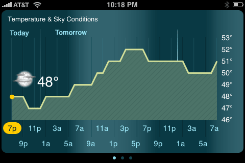
This is where MyWeather Mobile comes in. This app goes way beyond the features of the built-in weather app. The big feature for me is forecasts! Not just what it’s doing outside now. Like the built-in app, you can add multiple cities. However, in addition to enter the city, you can actually use your contacts list.

So for example, rather than putting in Scott’s city, I can just use his Contact info as a location and it will show me the weather where he lives. Also instead of having to put your current city in all the time, it’s location based and will always show you the weather of where you currently are located.

The graphics are great in this app. Very detailed and well done. It also supports a widescreen view of the trends screen. Just rotate your iPhone or iPod touch.

The bottom line

If the built-in weather app leaves you wanting more, then MyWeather mobile is worth a look. Do I think it should cost less, absolutely. However, if you need/want these features, then $9.99 is worth it. Otherwise, keep looking. After having it now for a few weeks, I don’t regret spending $9.99 on it. Works with the iPhone and iPod touch. You can check it out here on the App Store.

Why no 8″x12″ photo paper?

Everyone I know shoots digitally now! While I’m sure there are some folks out there that are perfectly content using film, I would dare say that there are more people shooting with digital cameras these days. I don’t do much photo printing, but when I do I always wonder why I end up having to crop my photo to fit the “traditional” sizes of 5×7, 8×10, etc. While visiting another photographer friend of mine, I happen to notice that she had tons of prints that were slightly larger than 8″x10″, they were 8″x12″. The beauty of this size is that your digital file will need little to no cropping. When I asked her where she got them printed, her response was Costco! I was stunned! While I had heard that lots of photographers use Costco with much success, I just didn’t believe it. 


Putting Costco to the test

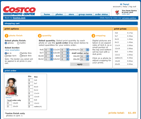
I decided to give it a try. I took one of my recent shots and exported it from Lightroom 2.1 as a high res JPEG and uploaded it to the Costco Photo Center site. A few days later, the print came back and I was very impressed with the quality. The color seemed dead on (I’m not a color fanatic, so Y.M.M.V.) and there was very little if any cropping. At $1.49 for an 8″x12″ print (membership required), I also couldn’t complain about the price! Most services charge roughly $3 for an 8″x10″. The shipping prices were also very reasonable (there is a pickup option too, but I don’t have time for that). By the way, the 8×12 print was on Kodak paper!


Same photo with an 8x10 crop

Same photo with an 8×10 crop


So why can’t I do it myself?

After my very positive experience with Costco, I wondered if I could just order some 8″x12″ inch paper for my Epson printer? Like I said, I don’t do very many prints, but it’s always nice to be able to print a photo on the spot in a pinch. Nope! Nada! The Epson store doesn’t carry this size. Then I just did a quick Google search for 8″x12″ photo paper and basically got nothing!!! I was shocked. I read a few stories about how paper is made and that “odd” sizes are more costly to produce. While that may be true, it would seem that there would be a market for this size even if the price was more. Yes, I’m sure that there is a company out there that either sells this size or will custom cut it for you, but the point is why isn’t it more main stream?


What about frames?

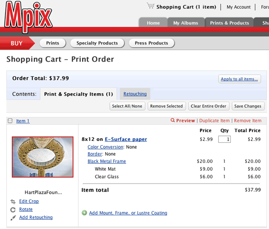
Of course this also begs the question, “what about picture frames?” Sure, there are some 8″x12″ frames out there, but the selection is slim. I also doubt that the average store is going to carry them on the shelf. Why would they if no one really carries the paper? Costco isn’t the only one that prints in this size. I also noticed that Mpix also does 8″x12″s ($2.99). They will also frame them for you and ship them ready to hang. It’s not cheap, but it is very good quality. I recently got some 20″x30″ images done by them, framed and I was very pleased with the results.


When will the industry change?

Why is the industry still stuck on these “old” formats (8×10, 5×7, 4×6, etc.)? When will we see it change? Your guess is as good as mine. However, I’m not going to wait for it to happen. When I need a print from now on it will be with a service that prints the sizes I want without losing part of my image. Perhaps Epson, Canon, HP, etc. will read this and start offering paper/print drivers in digital friendly sizes.

I can dream, can’t I?

How do you recycle your old gear?

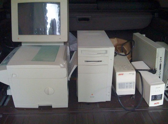
Usually when I upgrade to a new piece of gear, there is a family member, friend or eBay customer that benefits from my old gear. However, sometimes I hold on to stuff so long that it’s just not really worth the effort of trying to sell or pass down. I’ve been guilty in the past of just tossing old outdated electronics in the trash. However, this year I wanted to start doing the right thing by recycling my ancient stuff. Luckily someone posted a message on my user group’s bulletin board about a “recycling event” nearby where you could just drive up with all your unwanted gear and they would take it off your hands. Although I had a million things going on that weekend, I said to myself “when am I going to get another chance like this to dump all this stuff that’s just taking up space?” So I loaded up the back of the SUV and headed over to the lot on a rainy Saturday morning. 

There was a semi truck and a team of people unloading people’s cars. The whole process was painless! I left with a warm fuzzy green feeling about the whole thing and vowed never to just toss electronics again. From here on out I would dispose of my gear properly. If you’re looking for your local electronics recycling place, here’s a good site to start with.


The scary truth about the electronics and computers we discard

In a perfect world our old gear is recycled responsibly. However, where there is a buck to be made, there will be corruption and laws broken. Check out this scary video about the reality of the recycling underworld:


Also check out this Popular Mechanics article: Recycling Myths Debunked – Interest Recycling Facts.

I made Amazon’s “Top 10 Must-Have Books”

Once again I’m honored to have one of my books on one of Amazon’s “Top Lists”! Last year I had the distinct honor of having the #1 spot on their editor’s picks for the 2007 Best Computer Book. Well this year, I’m thrilled once again to be on their list. This time my iPhone Book 2nd Edition, co-authored with my buddy Scott Kelby, has made Amazon’s “Top 10 Must-Have Books” for the 2008 holiday season. What makes it even more special this year is that their Top 10 Must-Have Books list is of ALL BOOKS, not just computer books. It was just last week that I published my own 2008 Holiday Gadget Gift Guide, but now to be on Amazon’s list just makes my freakin’ day! What a great start to a very busy week. Happy Monday! 🙂

Also I’d like to congratulate both Scott Kelby and Joe McNally for making Amazon’s Best Books of 2008 list!

iPhone App of the Week – Sportacular

Admittedly I’m not a huge sports fan. In other words unless it’s something special, I don’t plan to watch sports on TV. That doesn’t mean that I don’t have favorite teams and like to engage in conversations with friends about who’s winning and who’s losing. Speaking of losing, no cracks about the Detroit Lions. Enough said.

Sportacular gets it right

Sportacular is a FREE app for the iPhone and iPod touch that allows you to keep track of your favorite teams. The interface is brilliant. You simply select your favorite teams across national and college leagues and Sportactular will give you up to the minute scores, schedules of upcoming games, and stats.

Just last weekend I was in a workshop and someone mentioned that the Lions were playing. So I pulled out my iPhone and tapped Sportacular and in a few seconds I had the score (they were winning by the way at the point). Scores are updated every 30 seconds as long as the app is running. Every year my buddy who graduated from Ohio State likes to come over and watch the Ohio vs. Michigan game. I have no vested interest in either team, but it’s fun watching him get all worked up. With Sportacular I can keep track of Michigan’s college games too including the schedule of upcoming games.

Sportacular is another example of a well thought out app that just works! That’s why it’s my pick for the iPhone App of the Week. It’s free and has minimal ads. Download it from the App Store.


Congratulations to the winners of the iPhone Photo Contest

I want to take a moment to congratulate and thank the Winners of the iPhone Photo Contest. Lot’s of great entries and it was certainly hard to pick winners. Luckily the public helped out in a big way by voting!