
I give presentations all the time and while I’m not a big fan of slides, when I do have to give a slide presentation Apple’s Keynote is my app of choice. Prior to my iPhone I used to use Salling Clicker on my Palm Treo 650 to remote control my slides via Bluetooth. I do miss that one aspect of my old phone. As you know, I’m a big fan of Apple’s “Remote” app that allows you to control your iTunes app or Apple TV via your iPhone or iPod touch. The app is very well done and feature complete. So needless to say, I just figured that when Apple announced that they were releasing another Remote app that allowed you to remote control your Keynote ’09 presentations, it would be just as good.
Â
Basic Functionality
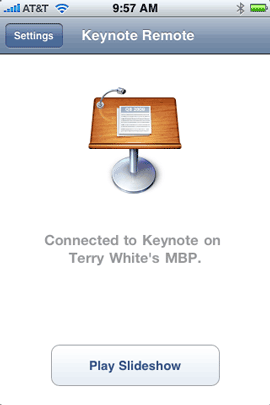
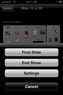
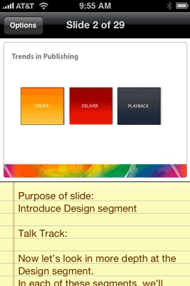
The Keynote Remote app pairs with your iPhone/iPod touch and your Mac running Keynote ’09 via Wi-Fi. So both your iPhone and Mac need to be on the same Wi-Fi network. That in and of itself could be an issue depending upon your presentation venue (more on this later). Once you have the two paired you can open a Keynote presentation on your Mac and then start playing it on your iPhone. Once Keynote is in “Play” mode you can see the current slide right on the iPhone’s screen including your speaker notes. To advance to the next slide you swipe your finger across the screen. You can also go back to the previous slide. There is a few second delay from the time the slide appears on the big screen until it appears on your iPhone’s screen. That’s about it!
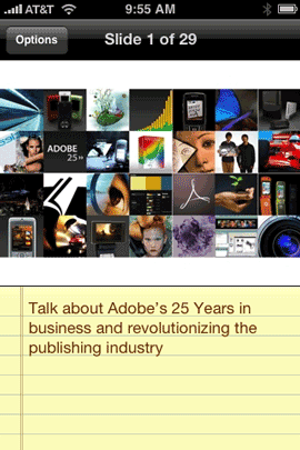
My slides displaying on the iPhone complete with the speaker notes that were keyed into Keynote.
Â
What’s missing?
Although this app does what it advertises, there is so much more that it could do. The first thing that I missed was a configurable slide/presentation timer. In other words, I’d like to see how much time I have left while doing my presentation. I’d like to configure a 10 minute and 5 minute warning beep or vibrate. While I appreciate the coolness of a finger swipe to advance slides, it would be more practical to have a large forward/back onscreen overlay button. If your thumb is at the top of the screen it would advance the slides forward, if it’s at the bottom, it would go back a slide. These are simple fixes that Apple can add. However, the big thing is that this App works over Wi-Fi instead of Bluetooth. Bluetooth is such a natural fit for this kind of app. Granted the range wouldn’t be as good, but there’s no reason why the app couldn’t work over Wi-Fi or Bluetooth. Since it only works over Wi-Fi this means that you would either need to have a Wi-Fi connection in your presentation venue OR you would need to setup an ad-hoc network between your Mac and iPhone. Another concern that presenters shouldn’t have to worry about. Although the app allows for controlling your presentation in portrait or landscape orientation of your iPhone, you have to set it in the preferences. I would have expected Apple to take advantage of the accelerometer and simply allow you to tilt your iPhone to change the orientation.
Â
The Bottom Line
The Remote app for iTunes/Apple TV sets the bar for remote apps on the iPhone! Unfortunately, the Keynote Remote app doesn’t live up to this standard. I was also stunned that Apple charged 99¢ for this app. Considering that Remote is a FREE app and the Keynote Remote app requires Keynote ’09, you would think it would just be included in iWork ’09 or FREE. With these limits, you might be wondering WHY would I name this app, App of the Week? I chose this app because it does work, but more importantly it does have potential! The things that it needs (with the exception of Bluetooth control) are easily added! If Apple quickly follows up with a 1.1 update that adds the things I listed above, then this app would kick butt. Luckily this isn’t the only app that allows you to remote control a Keynote presentation. The favorite seems to be “Stage Hand.” $7.99
Apple’s Keynote Remote app is compatible with iPhone and iPod touch and of course requires a Mac running Keynote ’09. You can check out Keynote Remote here on the App Store for 99¢.


My only complaint is the crappy icon. I mean, common. Apple couldn’t come up with a better icon that pasting the keynote icon in a square? Now don’t tell me how long they took to design the green ‘play’ button (most probably grabbed from some stock icon pack).
Not only a great iphone app, but a compelling reason to upgrade to 09!