One of my hobbies is critiquing and redoing user interfaces in my head. I have been slowly making a transition from my Nikon DSLRs cameras to Nikon Mirrorless cameras. I started with a Nikon Z6 and now use the Nikon Z6 II pretty much as my primary camera. I’m not quite ready to sell my Nikon D850 because it’s just so good! However, I can see the day in the future where I just shoot with mirrorless bodies.
I’ve never been a big fan of Nikon’s menu system
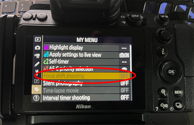
Although I have enjoyed shooting Nikon since 2007, If you were to ask me to name the things that are my least favorite, the menu system would certainly be high on the list. At least the new Z mirrorless models do have a touch screen. This makes moving through the menus a little faster as you can just tap on the option you want instead of having to arrow up, down, left, and right all the time. I have a suggestion I’ll share at the end that would make all the difference in the world, but that’s not why I’m writing this post. I’m here today to point out something that really pisses me off. I noticed it first with the Z6 and have run into it on the Z6 II as well.
You can’t use that feature and I’m not going to tell you why!


