

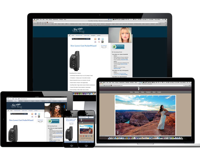
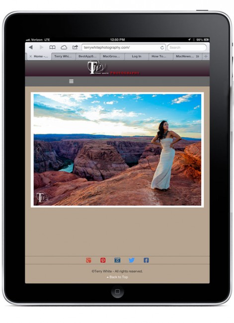
In case you haven’t noticed this site was updated with a “responsive” design a couple of weeks ago by the very talented web designer Erik Bernskiold. With the use of custom CSS he has made it so that the same site/content is displayed nicely no matter what screen you’re viewing it on. If you’re looking at this post on your computer go ahead and give it a try by simply resizing the window to be more narrow from the right. The page will respond and the content will scale or readjust as needed all the way down to a smartphone size. The same goes for my BestAppSite.com While I have the good fortune of Erik working on my terrywhite.com and bestappsite.com sites, I have other sites that I maintain myself. My Terry White Photography.com site is also now responsive thanks to an update to the The Turning Gate Lightroom Plug-ins that I use to generate my photography site. At last my photography site also looks even better on desktops, tablets and smartphones. The fun doesn’t stop there. I use Adobe Muse to author my MacGroup.org site and using Adobe Muse I was able to add both Tablet and Smartphone layouts to that site. Adobe Muse doesn’t currently offer responsive design, but it does offer the ability to create tablet and smartphone friendly layouts. There are pros and cons to both and here’s a great article that weighs in on the Responsive vs. Mobile Layout Debate. With that said, the MacNews blog (blog for MacGroup-Detroit) is now Responsive thanks to a template update by Page Lines.
Like I said, I have Erik to work on my major sites that don’t require as much day to day design updating as my other sites and thanks to Adobe Muse, 3rd party WordPress plug-ins and The Turning Gate I can have a good mobile experience on all my other sites. I’m in no way a “professional” web designer/developer, but I do have websites to maintain. If you’re wanting to make your site Responsive and you don’t have an “Erik” you should check out the new Adobe Edge Reflow tool. If you want to build your own sites with mobile layouts, check out Adobe Muse.